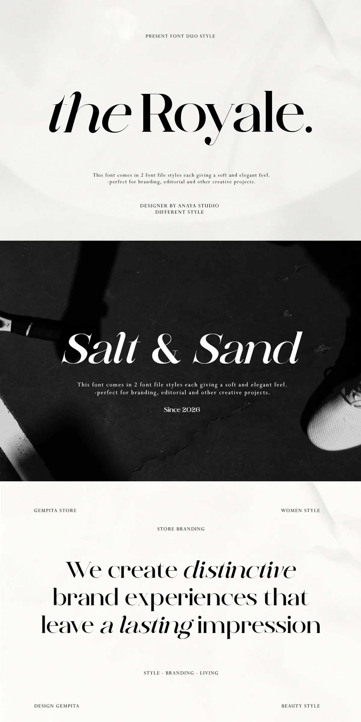
Royale delivers a confident voice that elevates high-end brands and editorial projects. It combines refined letterforms with pronounced contrast and elegant curves to produce a timeless yet contemporary appearance. The typeface actively communicates luxury and poise: use Royale for fashion editorials, couture branding, luxury packaging, and wedding stationery where a polished, memorable identity matters.
Distinctive duo-style concept for flexible design systems
Royale’s duo-style concept gives designers two complementary voices within a single family, enabling cohesive systems that shift between classic and contemporary tones. Use the more traditional duo for refined headlines and logotypes that demand authority, and switch to the contemporary duo for modern subheads or editorial captions that require a livelier presence. This intentional contrast supports layered typographic hierarchies and keeps visual identity consistent across print, web, and packaging channels.
Duo-style flexibility for modern and classic needs
By pairing stylistic variants strategically, designers can maintain a unified brand while differentiating communication levels. Reserve the higher-contrast styles for display and hero treatments, then opt for the gentler weights for extended body text. This approach reduces reliance on multiple unrelated typefaces and accelerates production while preserving aesthetic control.
How designers should apply Royale across projects
Apply Royale to projects that benefit from clear typographic personality and high readability. For branding, craft logotypes and wordmarks that exploit the typeface’s refined terminals and stroke contrasts. For editorial work, use bold weights for attention-grabbing cover lines and medium weights for running text to keep long reads comfortable. For packaging and invitations, test Royale with tactile finishes—foil, embossing, and letterpress amplify its luxury cues and increase perceived product value.
Practical pairing and layout recommendations for best results
Pair Royale with a clean, neutral sans-serif to manage long-form digital reading or with a humanist sans for contemporary editorial systems. Increase tracking slightly on large display sizes to showcase the elegant terminals. For web use, choose web-optimized formats (WOFF/WOFF2) and implement font-display strategies to control rendering behavior. Test across viewports and sizes to ensure consistent optical balance and legibility.
Technical features and production-ready details
Royale ships with a thoughtful set of technical features that support high-quality production. Expect refined kerning, systematic metrics, and a complete range of weights and italics that allow precise typographic control. The family typically includes OTF for print and web fonts for responsive use, plus expanded glyph sets for multilingual support. These details let teams scale campaigns internationally without compromising typographic integrity.
Technical formats and production-ready files
- Multiple weights with corresponding italics for tight typographic hierarchies
- OpenType features such as ligatures and alternates for refined typesetting
- OTF and web font formats to streamline print and digital workflows
- Kerning pairs and tuned metrics for professional layout control
Why professional designers choose Royale for high-end projects
Designers choose Royale when they need a typeface that actively enhances a brand’s perceived sophistication. Its high-contrast strokes and graceful curves lend authority to fashion-focused campaigns while remaining legible for editorial text. The duo-style approach lets teams craft varied visual personalities without introducing new typeface families. Royale supports cohesive visual systems that scale from packaging to large-format display and from print to digital campaigns.