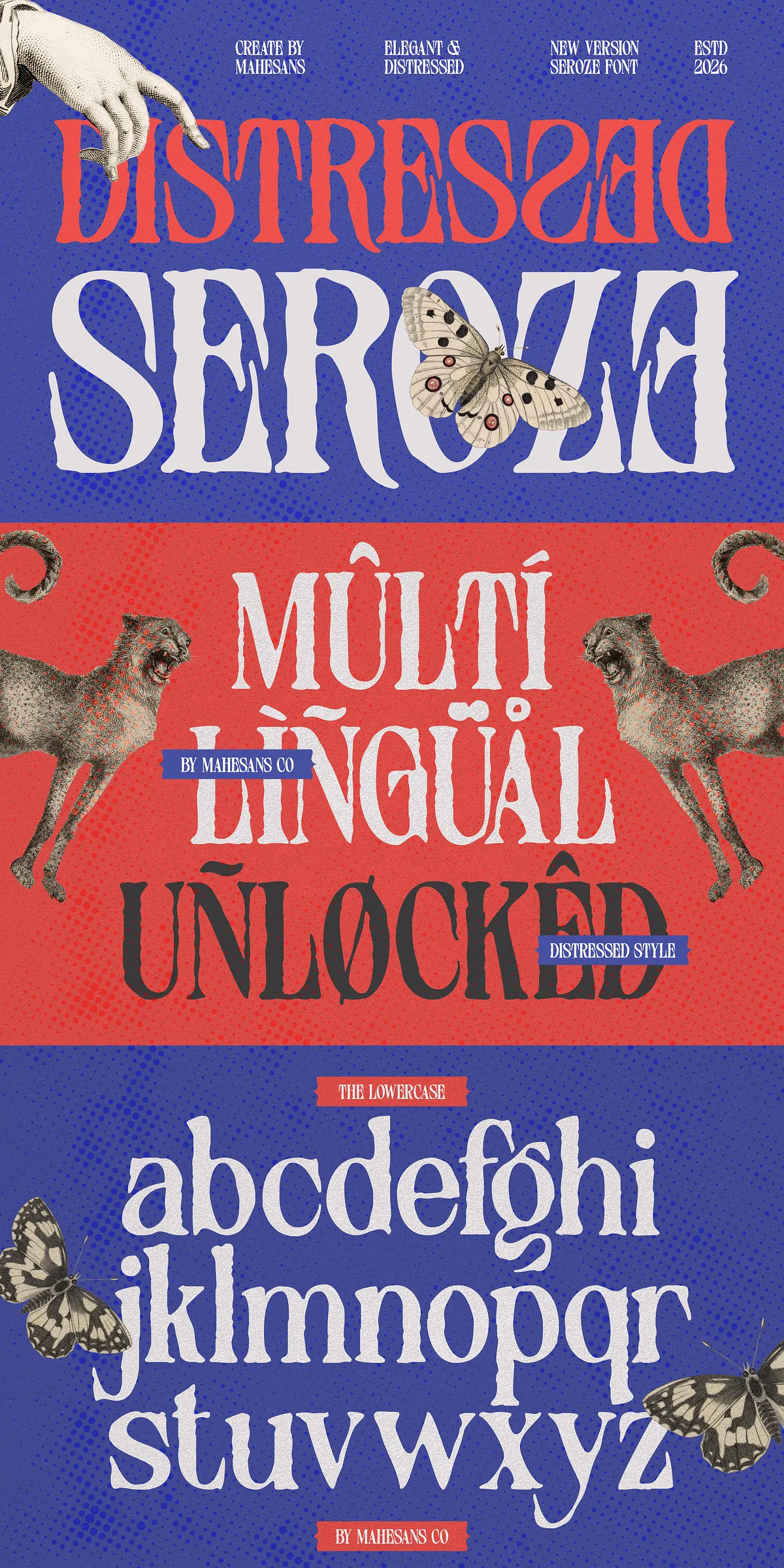
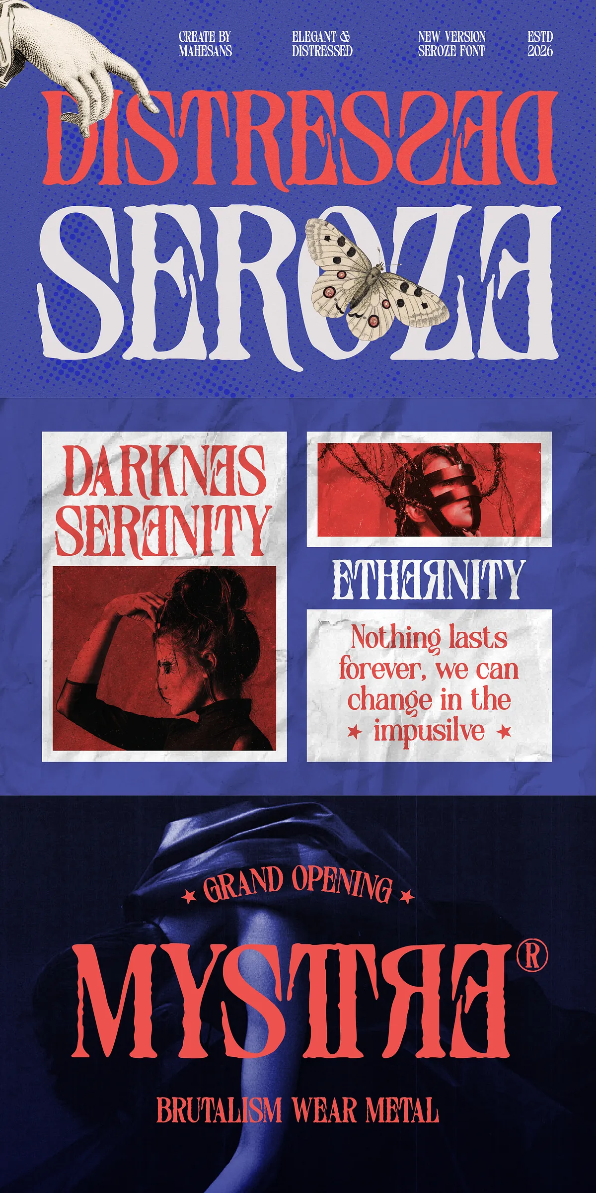
Seroze injects character and attitude into your designs by combining refined serif proportions with organic distressed texture. This family actively celebrates imperfections: subtle erosion, hand-worn edges, and nuanced ink-like marks that convey a handcrafted presence without sacrificing legibility. Seroze performs confidently across editorial spreads, identity systems, packaging, and digital campaigns where a sophisticated but rebellious voice matters.
A Bold Distressed Serif With Character And Purpose
Distinctive Letterforms That Demand Attention
Seroze’s letterforms feature flowing curves, expressive terminals, and balanced contrast that read beautifully at display sizes. The distressed details emphasize personality and history — they suggest age and authenticity while preserving strong forms for logos and headlines. Designers will find Seroze naturally attracts the eye and reinforces a brand’s narrative through typographic texture.
Intentional Distress With Controlled Readability
Each stylistic weathering mark has been applied to enhance mood without undermining readability. Seroze’s metrics, spacing, and kerning are tuned to handle large-format prints as well as responsive web layouts. Use heavier weights for dramatic, poster-scale statements and lighter weights when a refined, vintage tone is needed in packaging and editorial lead-ins.
Practical Applications And Creative Use Cases For Designers
Versatile Use Cases For Designers And Brands
- Fashion branding and luxury logos that need a bold, handcrafted signature
- Editorial covers and magazine spreads where attitude meets refinement
- Packaging designs that benefit from premium, tactile character
- Posters, album covers, and promotional art that demand instant recognition
- Social content and advertising campaigns that require expressive headlines
Pairing Strategies For Strong Visual Hierarchy
Pair Seroze with a neutral sans-serif for body copy to maintain legibility and modern contrast. For more vintage-forward systems, combine Seroze with a clean slab or geometric sans to preserve clarity while reinforcing crafted aesthetics. Use the distressed styles for primary display and keep unweathered or semi-distressed weights for secondary headings and subbrand marks.
Features, Formats, And Production Details For Fast Integration
Comprehensive Feature Set For Production-Ready Typography
Seroze includes full uppercase and lowercase alphabets, numerals, punctuation, and common ligatures to improve rhythm and flow. The family supports multiple languages with diacritics for broad Latin coverage. Delivered with standard desktop and web formats, Seroze fits modern design workflows and production pipelines.
- Included formats: OTF, TTF, WOFF, WOFF2
- Character set: Uppercase, lowercase, numerals, punctuation
- Typography features: Common ligatures and coordinated spacing
- Platform compatibility: Works on PC and Mac, integrates with major design apps
- Multilingual support: Latin-based languages covered
Simple Installation And Smooth Workflow Integration
Install Seroze like any modern font package: desktop OTF/TTF for print and design apps; WOFF/WOFF2 for web embedding. Test kerning and optical sizes when you scale for billboards or shrink for product labels. When exporting for print, convert type to outlines for exact texture preservation where necessary.
Licensing, Best Practices, And Implementation Guidance
Licensing Notes And Extended Use Considerations
Review the license included with your purchase for desktop, webfont, app embed, and commercial usage rights. Contact the foundry or distributor for extended options such as additional language support, custom glyphs, or enterprise licensing. Ensure proper webfont formats and subsets are generated for efficient delivery when embedding in production sites.
Design Tips For Maximum Impact With Seroze
Leverage Seroze’s distressed texture as a primary brand voice in hero imagery and packaging to create tactile personality. Reserve cleaner or semi-distressed weights for text-heavy layouts. Combine generous letter spacing with heavier weights for striking headlines, and enable ligatures where available to maintain fluid connections in display settings.