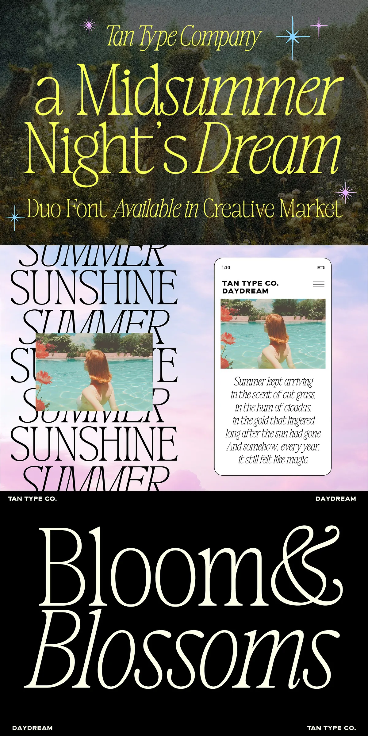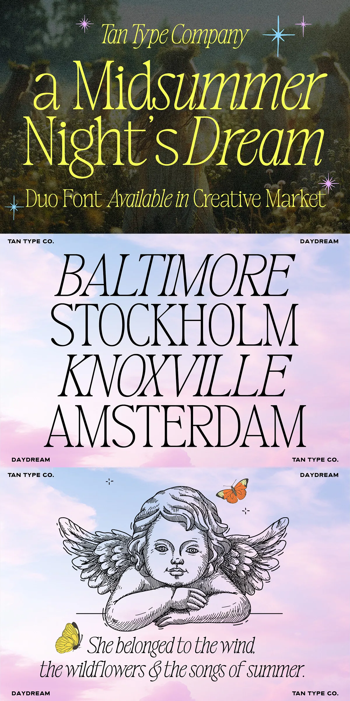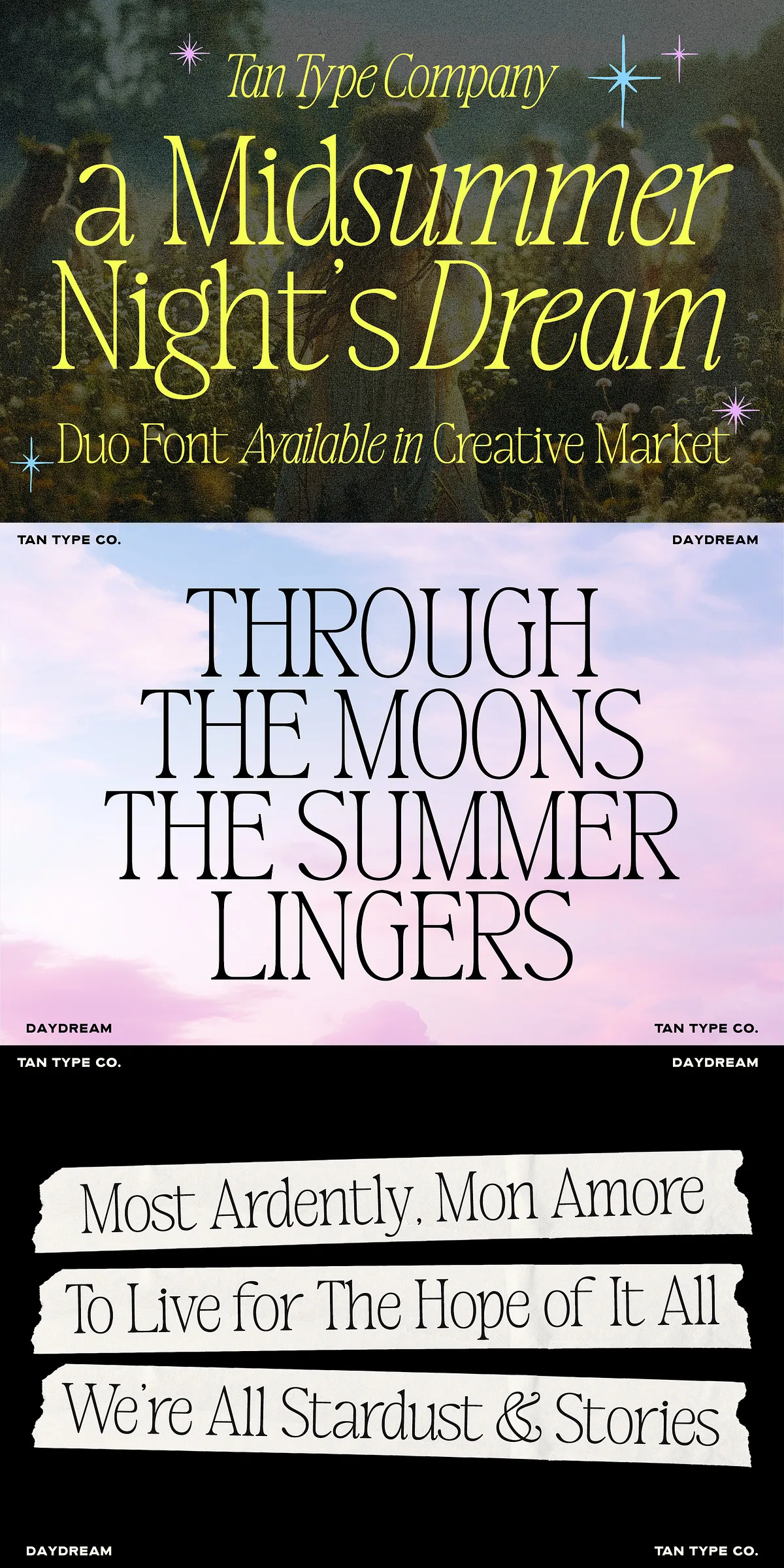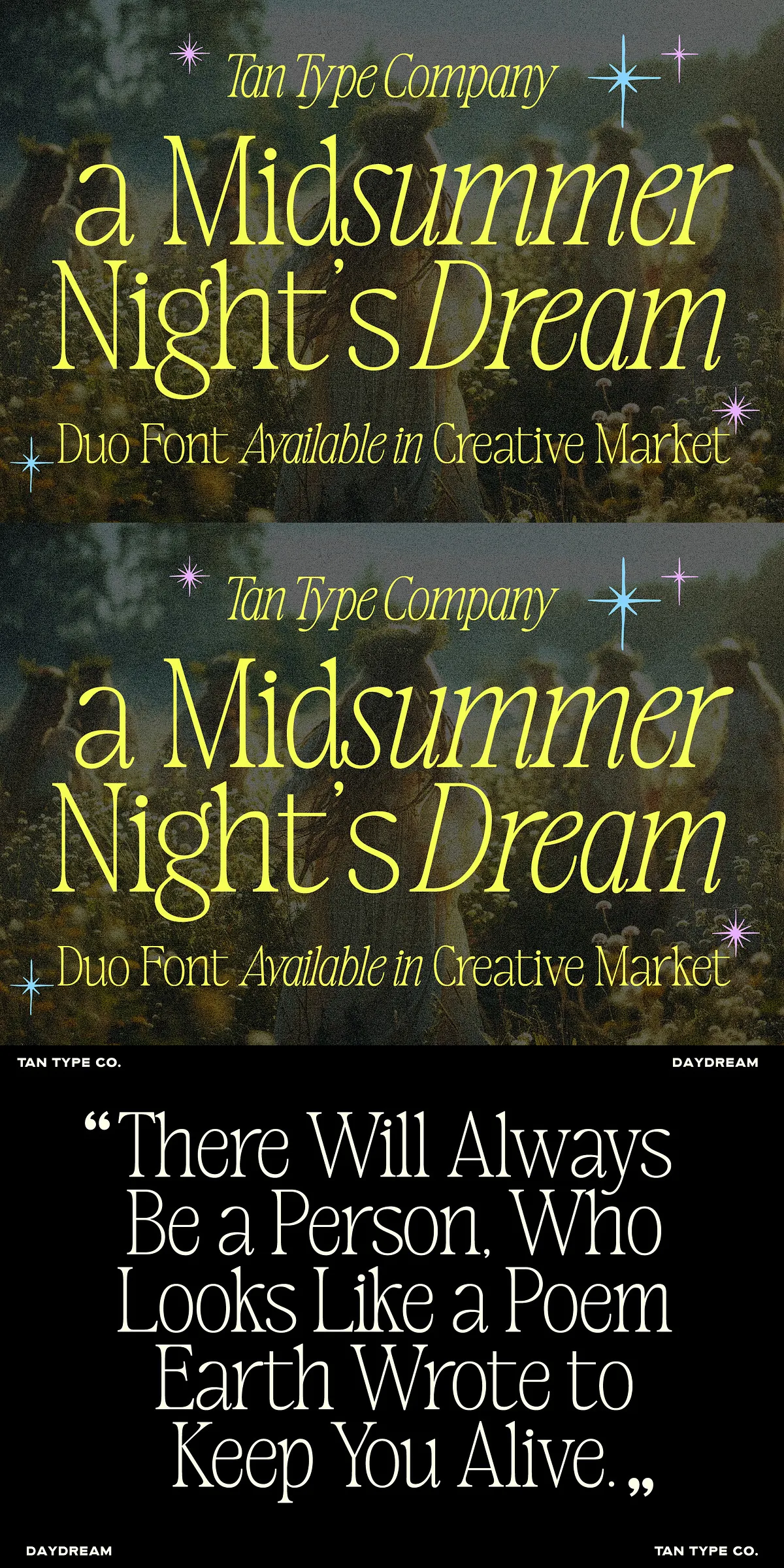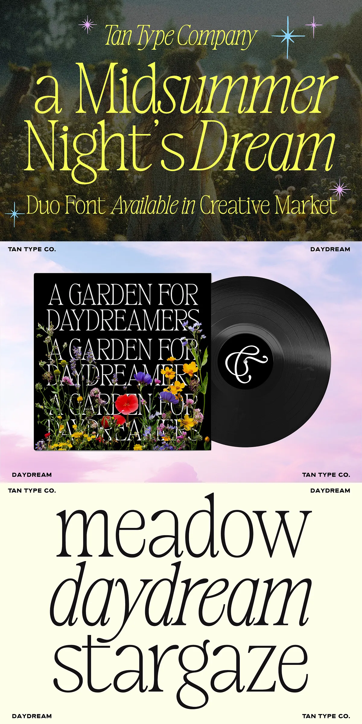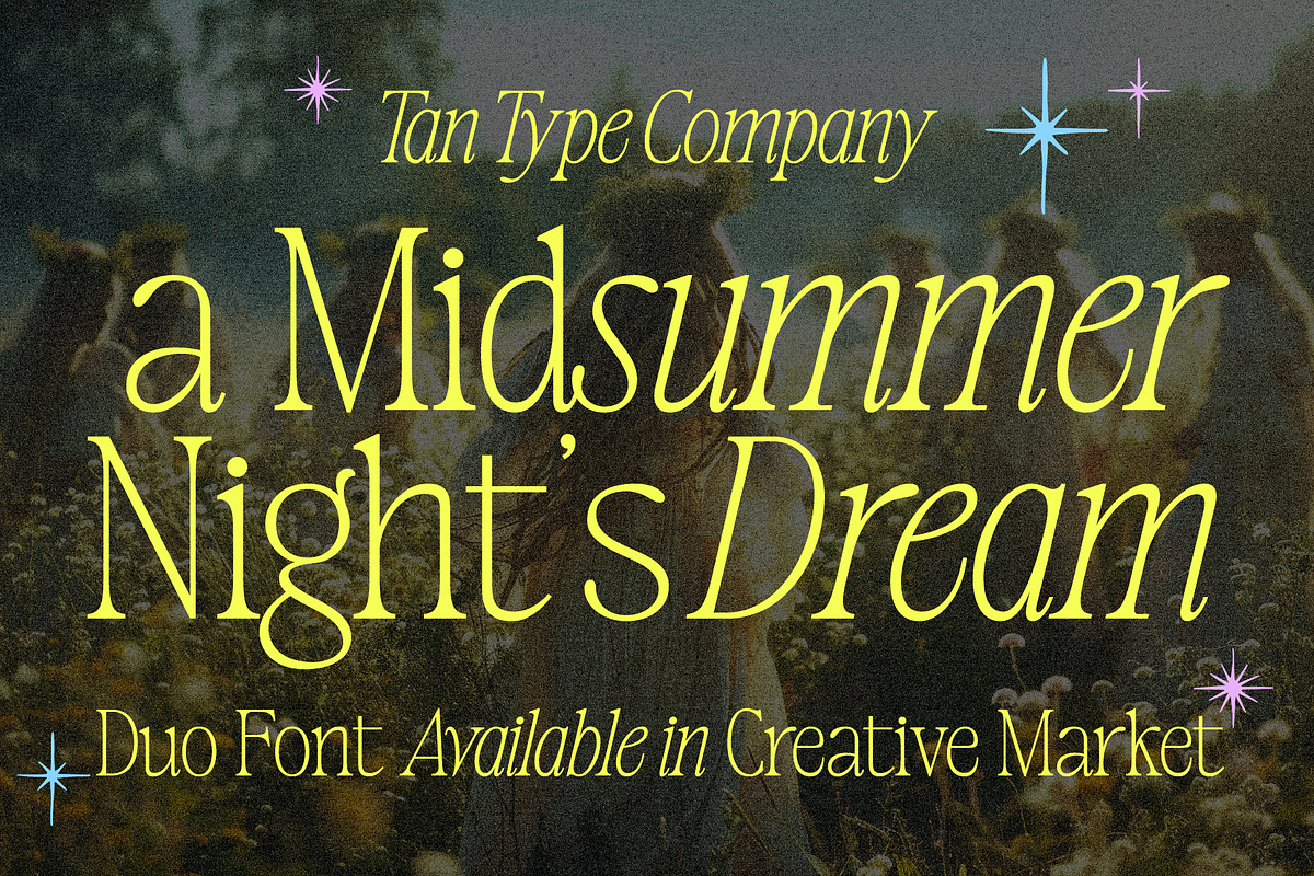

TAN-Midsummer captures the warmth of golden evenings and the gentle motion of wildflower fields. This serif duo presents refined proportions, delicate contrast, and a beautifully flowing italic that together create a voice of nostalgia and quiet luxury. Designed to perform across high-end visual systems, Midsummer transforms ordinary text into memorable, emotive messaging that speaks clearly and elegantly to discerning audiences.
TAN-Midsummer Evokes Golden Evenings And Poetic Memories
Midsummer places graceful letterforms at the center of your design. The roman style displays moderated contrast and measured serifs that read confidently at display sizes, while the companion italic moves with a handwritten cadence that suggests personal notes or a cherished letter. Use Midsummer to conjure mood and narrative: it invites readers to linger, to feel the texture of a page, and to associate your project with handcrafted quality and thoughtful composition.
Why Choose Midsummer For Visual Identities And Packaging
Designers choose TAN-Midsummer because it balances decorative detail with functional clarity. The typeface performs exceptionally in contexts where elegance and readability matter equally: headline systems, packaging labels, brand marks, and editorial covers. Its serif details enhance perceived value, making logos and product names feel artisanal and intentional. At the same time, careful spacing and open counters ensure strong legibility across print and digital outputs.
Ideal Applications And Creative Use Cases For Midsummer
Midsummer excels in projects that require a refined typographic voice. Deploy it for wedding suites and invitations to evoke romance and ceremony. Set it large on magazine mastheads and fashion editorials to capture attention with cinematic presence. Apply it to book covers and long-form titles where the italic can introduce narrative warmth. Use it on premium product packaging to communicate heritage, quality, and a hand-finished aesthetic. In every use, Midsummer amplifies nuance and elevates the emotional tone of your message.
Practical Pairings And Design Recommendations For Best Results
- Pair Midsummer with a neutral sans-serif for extended body copy to maintain readability while the serif leads headlines.
- Reserve the italic for subheads, pull quotes, or short passages where a personal tone benefits the hierarchy.
- Increase display sizes for logotypes and packaging headlines so the delicate contrast and terminals register cleanly in print.
- Test on final substrates and finishes to ensure contrast, ink behavior, and surface texture support your intended look.
Technical Notes, Compatibility, And Language Support
TAN-Midsummer installs like a standard font family and supports OpenType features that unlock ligatures, alternates, and typographic refinements. The family offers multilingual coverage for a wide set of Latin-based languages and will receive free future updates to expand glyph support and technical options. To access the full feature set, confirm that your design software supports OpenType features; popular professional tools such as Adobe InDesign, Illustrator, and Affinity Designer fully support these capabilities.
Canva Compatibility And Support Recommendations
While Midsummer can be used in Canva, note that Canva’s current support for advanced OpenType features is limited. Some ligatures, alternates, and special characters may not appear in the Canva environment. For full typographic control, design and generate final assets in applications that expose OpenType functionality, then import rasterized or vector exports into web-based tools if needed.
Licensing, Updates, And Where To Get Help
Confirm licensing terms before deploying the typeface in commercial products, packaging runs, or broadcast projects. The family includes free future updates and responsive support for technical questions. If you need assistance, contact the foundry or consult the support channel included with your purchase for installation guidance, feature activation, and licensing clarification.