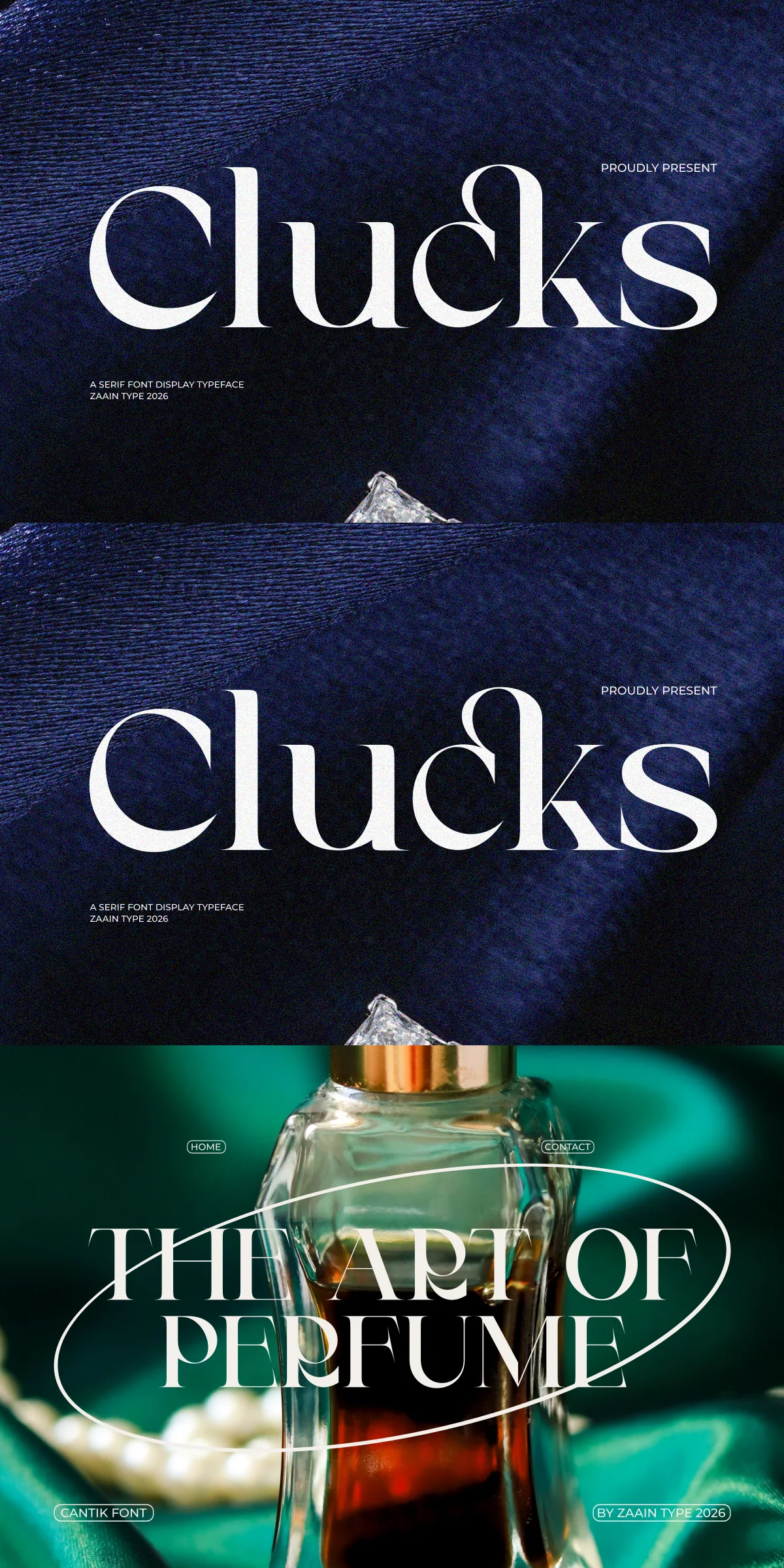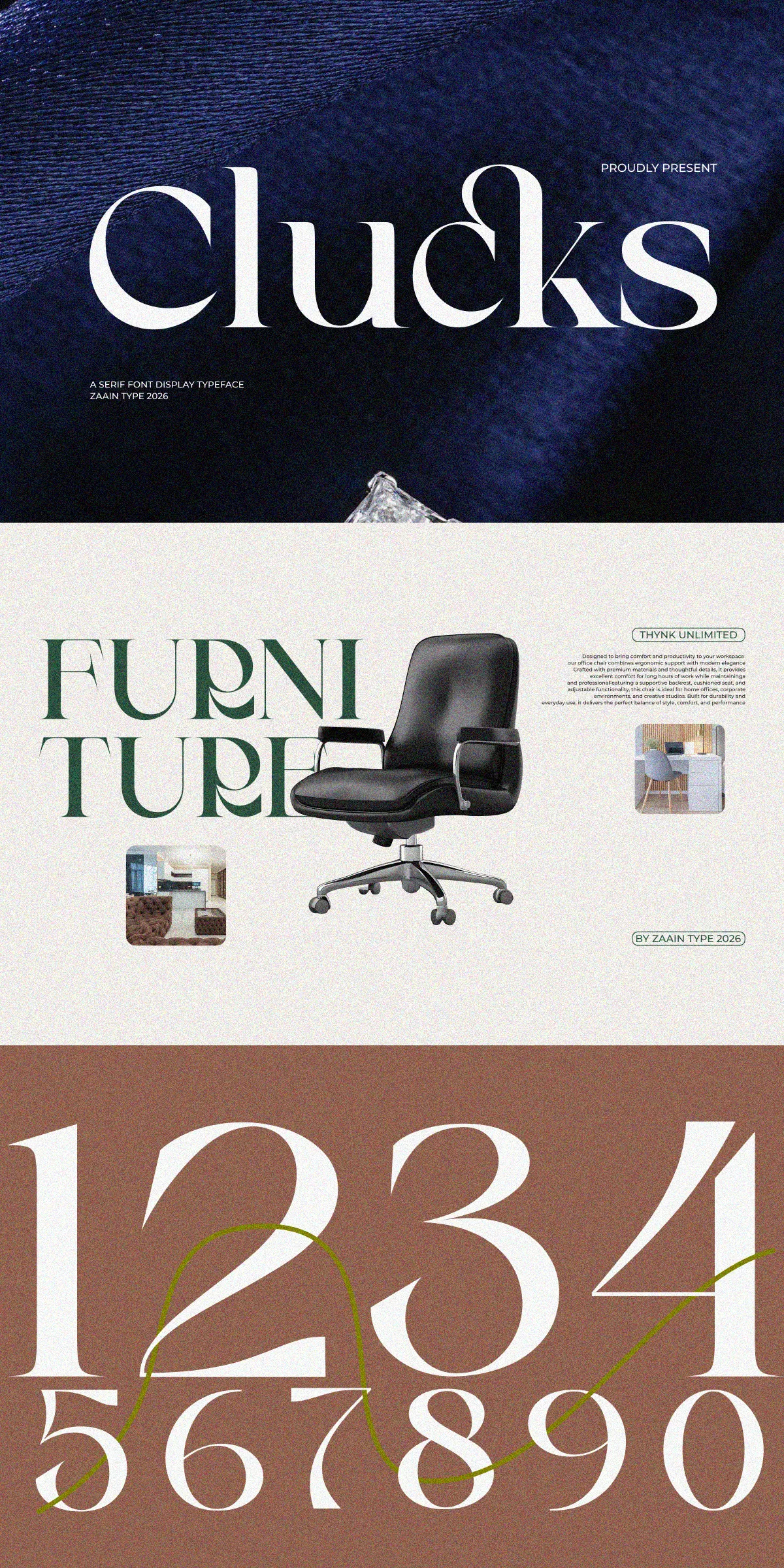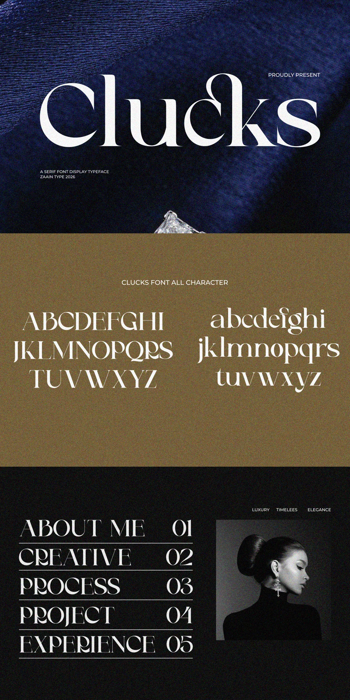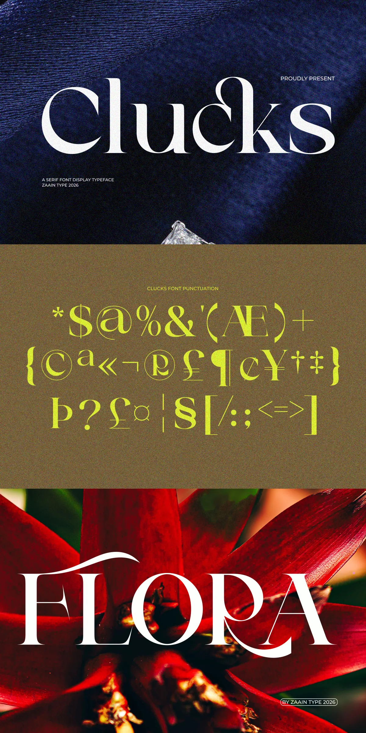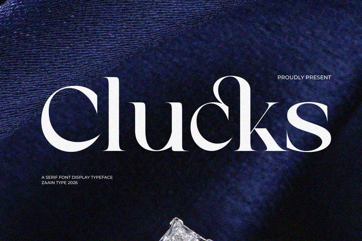

Clucks commands attention with refined letterforms, balanced proportions, and a poised personality that lifts every creative project. Designed as a display serif, Clucks combines classical serif structure with a contemporary sensibility so designers can create work that feels both timeless and modern. Use Clucks to add clarity and character to headlines, logos, and premium packaging while maintaining excellent legibility where it matters.
Clucks Brings an Elegant Modern Serif Voice to Creative Projects
Clucks projects sophistication through decisive strokes and thoughtful details. The typeface emphasizes contrast and graceful terminals to produce a luxurious tonal range that reads strong at large display sizes and remains readable in short blocks of text. Designers will find Clucks reliable for expressing a refined voice across visual identities, editorial spreads, and product packaging. Every glyph supports purposeful expression: subtle flares and tapered serifs add personality without sacrificing clarity.
Why Clucks Works Well for Premium Design
Clucks focuses on purposeful shapes that communicate confidence. The typeface enhances hierarchy and scales cleanly from dramatic magazine headlines to elegant invitation lines. Its modern construction allows it to pair effortlessly with neutral sans-serifs or more expressive script accents. Because Clucks balances ornament with restraint, it supports both minimalist brand systems and richly detailed art direction.
Ideal Applications for Clucks in Premium Design Contexts
Clucks fits naturally in contexts that demand a sophisticated presentation and distinctive typographic voice. Use it where you want text to read as carefully considered and high-end.
Perfect For High-End Branding And Editorial Systems
- Luxury branding and boutique logos that require an elevated typographic identity
- Fashion and lifestyle editorials that need cinematic headlines and refined mastheads
- Cosmetic and skincare packaging where polished typography reinforces perceived quality
- Wedding stationery, invitations, and event collateral that benefit from romantic yet modern letterforms
- Book covers, photography watermarks, and premium product labels
- Social media visuals and advertising that require immediate, elegant impact
Distinctive Letterforms and Design Features That Define Clucks
Clucks blends classic serif cues with contemporary adjustments to deliver a versatile display voice. The letterforms present a measured contrast between stems and hairlines, complemented by carefully shaped terminals and junctions that catch the eye in headlines. Decorative touches exist but remain controlled, enabling designers to introduce flair without losing functional clarity.
Key Typographic Qualities Designers Will Appreciate
- Refined contrast for strong visual rhythm in large sizes
- Balanced counters and proportions for improved legibility
- Subtle serif details that read as hand-finished yet consistent
- Versatility across modern and vintage-inspired aesthetics
Practical Usage, Pairing, and Production Recommendations
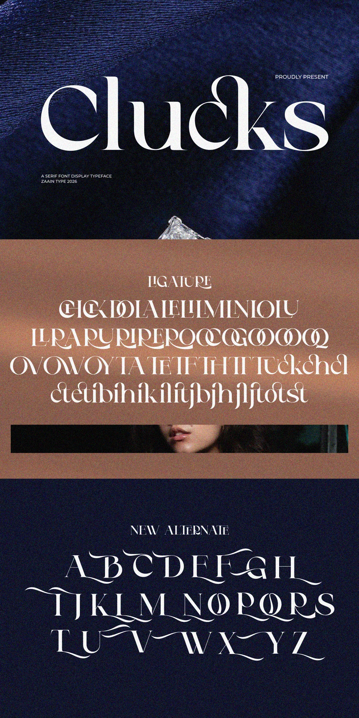
To maximize Clucks’ impact, emphasize display use and reserve highly decorative alternates for focal elements. Set display sizes generously so the refined contrast and terminals can register, and use tighter tracking on logotypes to create compact, elegant marks. When pairing, choose a neutral sans-serif for body copy to maintain readability while allowing Clucks to carry the brand’s tone in headlines and subheads.
Workflow Tips for Designers and Producers
- Use Clucks for headlines and logotypes, and pair with a low-contrast sans for long-form text.
- Proof on final substrates for print packaging to validate ink absorption and contrast.
- Limit decorative swashes to feature words to preserve hierarchy and avoid clutter.
- When exporting final artwork, outline text only after confirming kerning and ligature choices.
Installation, File Formats, and Technical Notes
Install Clucks using your operating system font manager or a dedicated font tool. Enable OpenType features in design applications to access ligatures, small caps, and stylistic alternates where available. Confirm licensing terms for commercial use and production runs—especially for packaging, retail, and broadcast. If multilingual needs exist, check glyph coverage and consult the foundry for extended language support or bespoke glyph requests.
Technical Checklist Before Production
- Confirm OpenType features in InDesign, Illustrator, or your layout app.
- Proof print on the intended paper or substrate to examine contrast and color behavior.
- Export high-resolution assets and outline text only when final spacing is locked.
- Validate licensing terms if you plan to use the font across multiple products or global campaigns.