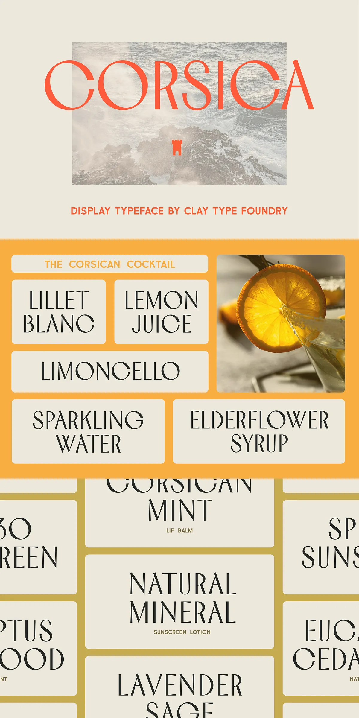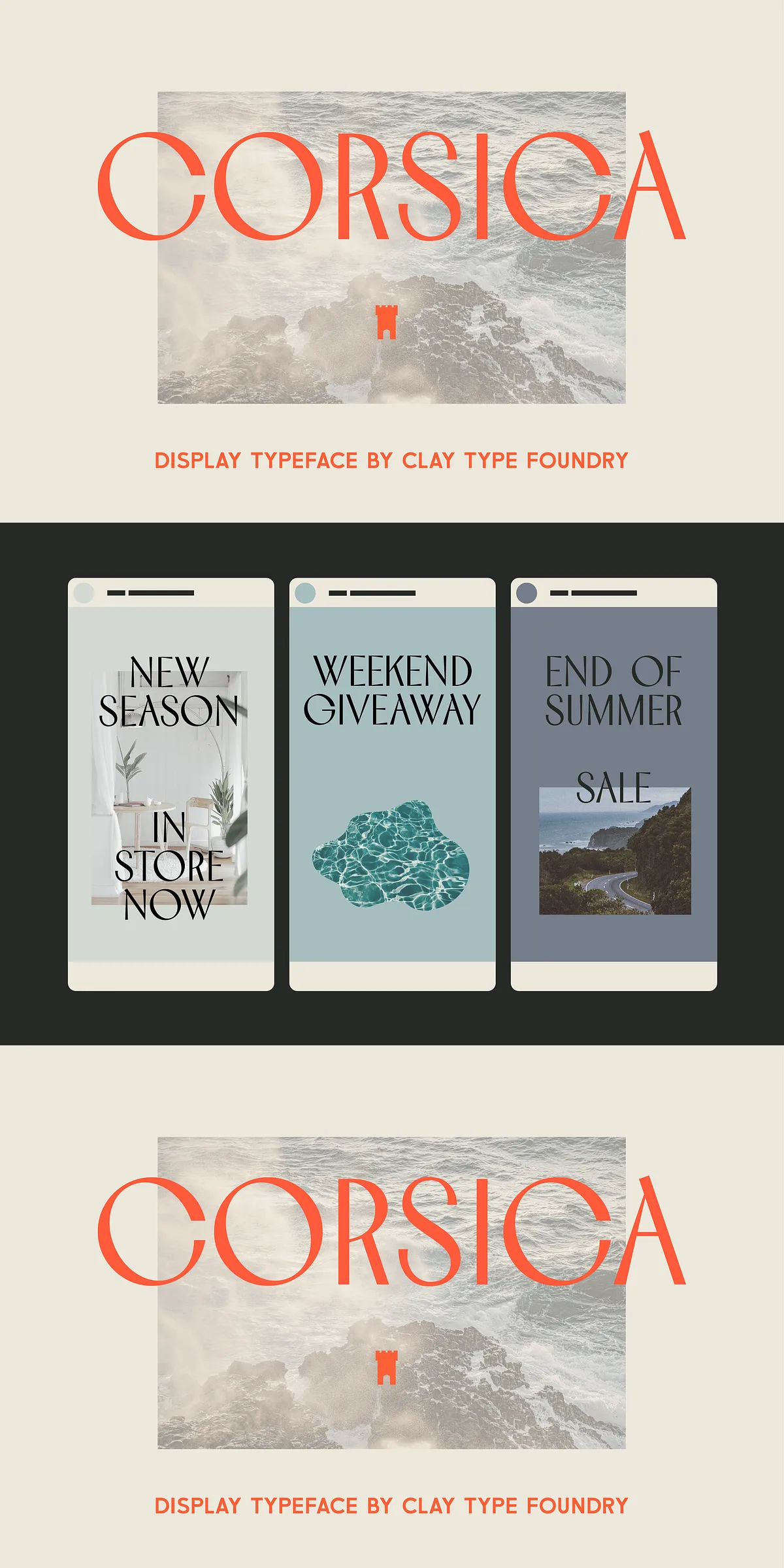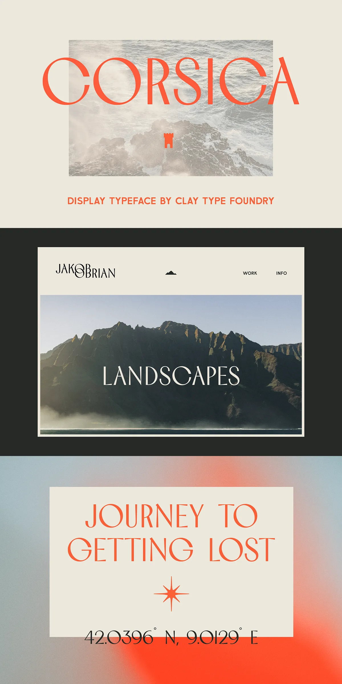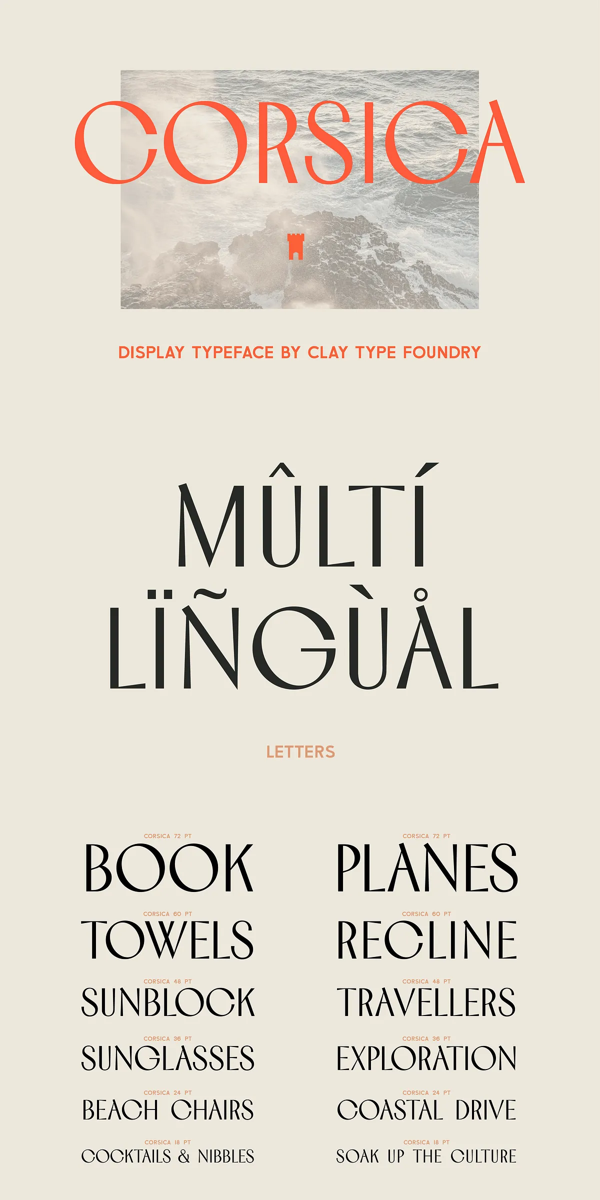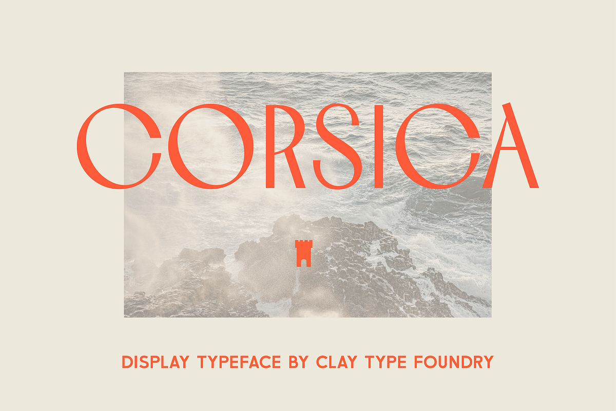

Corsica activates every headline with personality. From the adventurous, wide counters of the letters C, G, O and Q to the relaxed diagonal stress that runs through many glyphs, Corsica balances upright structure with laid-back motion. The result reads modern and nostalgic at once: a decorative display face that commands visual attention while carrying a warm, sunlit temperament. Designers will find Corsica particularly valuable when they need bold, readable statements that also express character and atmosphere.
Why Corsica Commands Attention In Logos And Headlines
Corsica performs strongly at large sizes where its unique counters and diagonal stress become defining features. Use it for brand marks, mastheads, poster headlines, and short-to-medium paragraph treatments where distinctiveness matters. The typeface’s personality naturally anchors compositions and provides instant recognition. When paired with a neutral sans serif for body text, Corsica creates clear hierarchy while keeping the overall layout clean and contemporary.
Practical Applications And Pairing Recommendations For Designers
Apply Corsica wherever you want to evoke Mediterranean warmth, rugged coastal landscapes, or an adventurous vintage spirit. It suits packaging, travel and lifestyle branding, editorial headlines, event posters, hospitality signage, and product logos. For pairing, select a restrained sans serif or a simple humanist serif to support extended copy. Let Corsica lead the visual tone in hero areas, and use the secondary face for readability in supporting text.
How Corsica Enhances Visual Identity And Brand Storytelling
When brands need a voice that feels both handcrafted and reliably modern, Corsica supplies a clear, expressive tone. Its wide counters lend a breezy openness, while the diagonal stress adds movement that reads as casual sophistication. Use Corsica to communicate travel, leisure, and artisanal quality. The font’s character helps stories travel—inviting audiences to imagine cliff-top views, seaside promenades, and sunlit terraces.
Technical Details Files And Language Support Included With Purchase
The Corsica package arrives ready for production across digital and print workflows. You receive high-quality OTF files and webfont-ready files for embedding. The design ships as an ALL CAPS display face with full numerals and punctuation, enabling clean, authoritative headlines and logotypes. Multilingual support ensures your message reaches international audiences without losing typographic integrity.
What’s Included In The Corsica Font Package
- ALL CAPS font file for consistent display use and strong logo treatments.
- OTF desktop format and webfont-compatible files for online deployment.
- Complete numerals and punctuation to support structured typographic layouts.
- Multilingual character support to extend global usability.
Best Practices For Production And Implementation
For web use, subset the webfont to reduce page weight and employ font-display strategies to avoid layout shifts. In print, test the font at final size and on your chosen substrate; Corsica’s unique counters respond beautifully to careful tracking and generous leading. When designing logos, leverage the caps-only structure to create compact, memorable marks. Pair with a subdued companion font to maintain readability in long-form contexts.
Creative Origins And Designer Note From Clay Type
Corsica was shaped by a longing for the Mediterranean—rugged mountains, clifftop panoramas, and slow afternoons by the sea informed its forms and temperament. Aroha nui — CLAY TYPE. The font invites designers to channel that same sense of place into bold, evocative visual work.