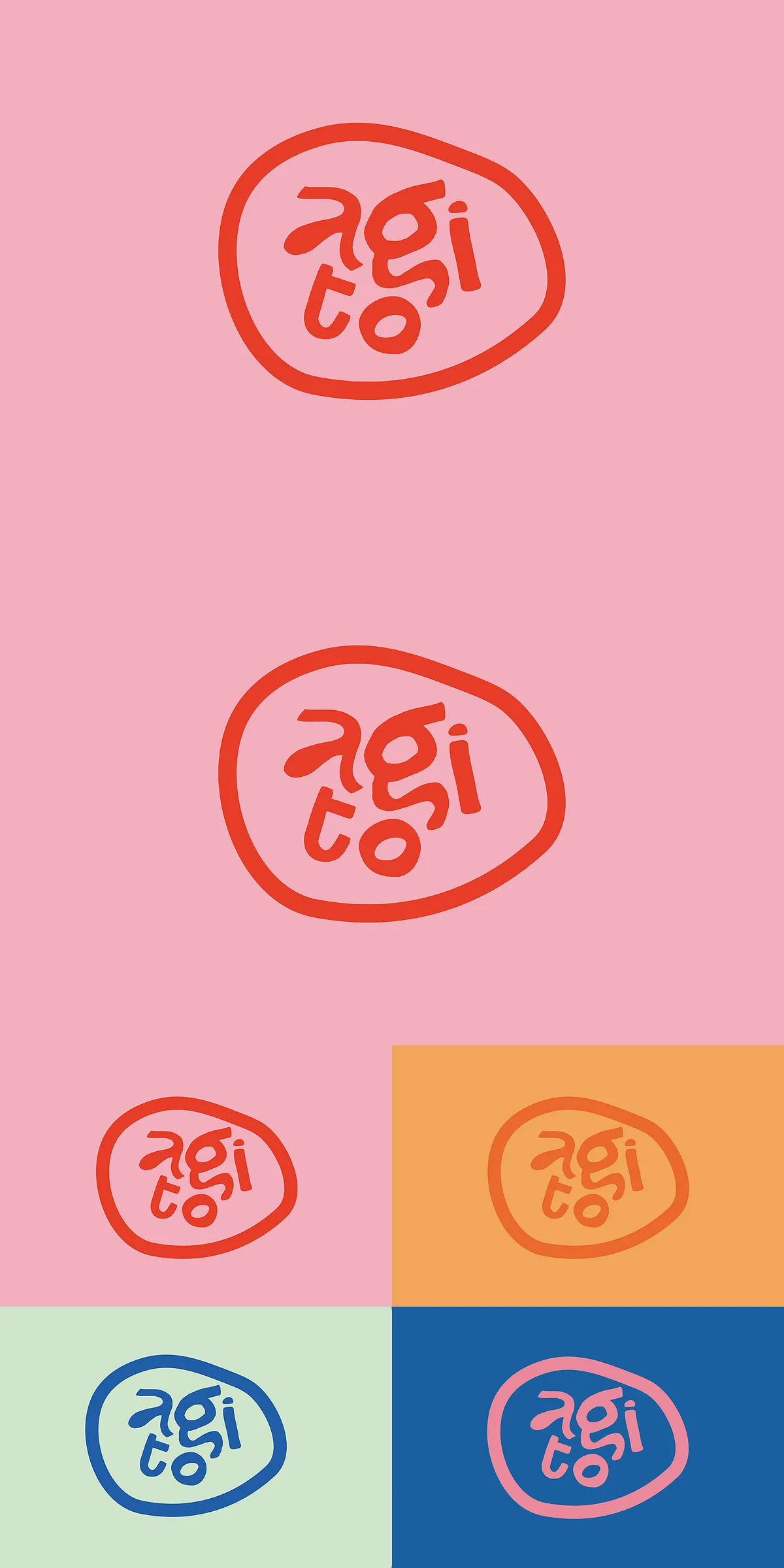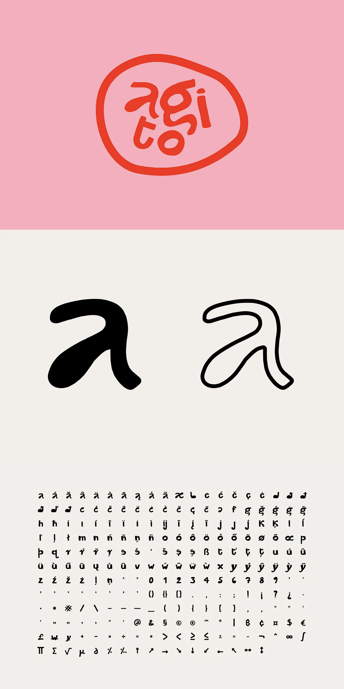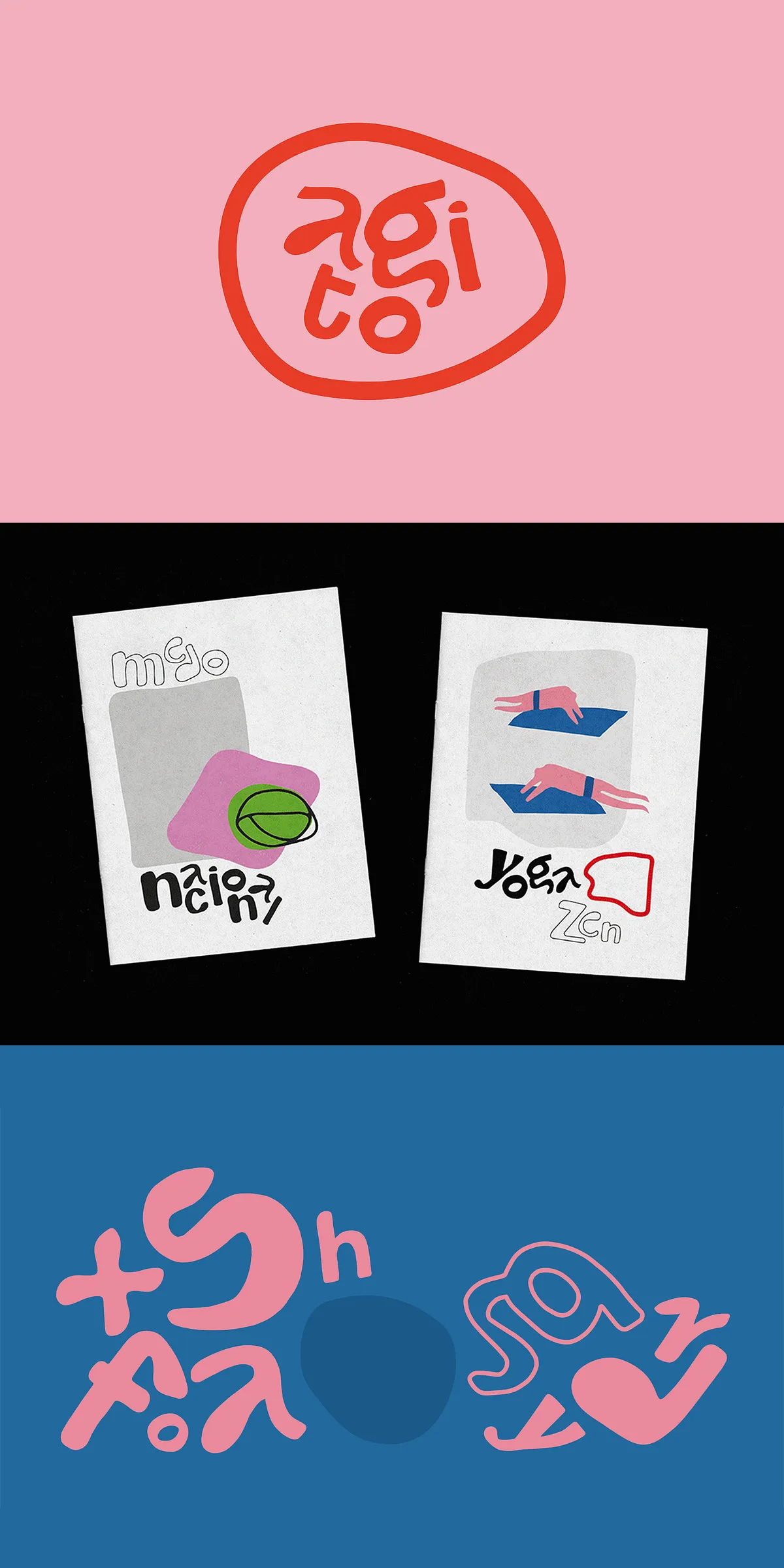

Agito channels the clarity and restraint of modernist design while preserving organic motion through ink-drawn letterforms. Each glyph began as a hand-rendered stroke and was refined digitally to preserve subtle curves and fluid connections. The result is a sans-serif display face that feels deliberate and alive: letterforms align with modernist geometry while retaining human rhythm and cohesion. This balance makes Agito especially powerful for typographic arrangements where visual harmony and personality must coexist.
Why Agito Excels In Posters Logos And Typographic Composition
Agito’s fluid counters and consistent stroke rhythm create striking headlines that command attention without appearing aggressive. Its crafted shapes offer instant recognition at large sizes, while its internal spacing and proportions maintain legibility in compact arrangements. Use Agito when you want typography to act as the primary design element — think bold posters, brand marks, editorial covers, and artistic layouts where letterforms carry mood and structure.
Included Files Character Coverage And Technical Specifications
The Agito package gives designers everything required for professional production across desktop and web workflows. Files are supplied in industry-standard formats and include extended character coverage to support international projects. The typeface arrives ready for use in design applications immediately after installation.
Package Contents And File Format Details
- Agito (OTF / TTF) — deliverables prepared for desktop and production workflows.
- Character set: Full Latin alphabet A–Z, numerals, punctuation, and extended multilingual characters (265-character file).
- PUA Encoded Characters for easy access to special glyphs and alternates in common design programs.
- Cross-platform compatibility: Works on Windows and macOS, and in Adobe Illustrator, Photoshop, Microsoft Word, Keynote, and Canva.
- License certificate included to authorize commercial and personal use per purchase terms.
Practical Uses Pairing Suggestions And Workflow Recommendations
Agito proves versatile across digital and print media. Its presence at large sizes makes it a natural headline face; at display sizes it defines tone and hierarchy. Pair Agito with a neutral serif or a soft humanist sans for body text to preserve readability while keeping a refined aesthetic. Use generous leading and subtle tracking in long lines to maintain open counters and preserve the handcrafted feel.
Suggested Typographic Pairings And Hierarchy Strategies
- Pair Agito with a readable serif for editorial systems to balance display energy with reading comfort.
- Use heavier display weights for primary headlines and lighter weights for subheads to create consistent contrast.
- Leverage alternate PUA glyphs to introduce stylistic variety in logotypes and headline treatments.
Licensing Implementation And Production Best Practices
Before deploying Agito in commercial projects, review the included license certificate to confirm permitted uses for web embedding, desktop installation, and product reproduction. For web use, convert fonts to WOFF2 and subset glyphs to optimize load time. For print, test weight and tracking on the final substrate to account for ink spread and visual weight. When integrating Agito into platforms like Canva, follow platform-specific font upload and licensing instructions.
Accessibility Performance And Optimization Tips
- Ensure sufficient color contrast between Agito headlines and backgrounds to meet accessibility standards.
- Use font-display strategies (such as font-display: swap) and subsetting to prevent layout shifts on the web.
- Test legibility at target sizes and across devices, especially when using detailed PUA alternates or tight tracking.