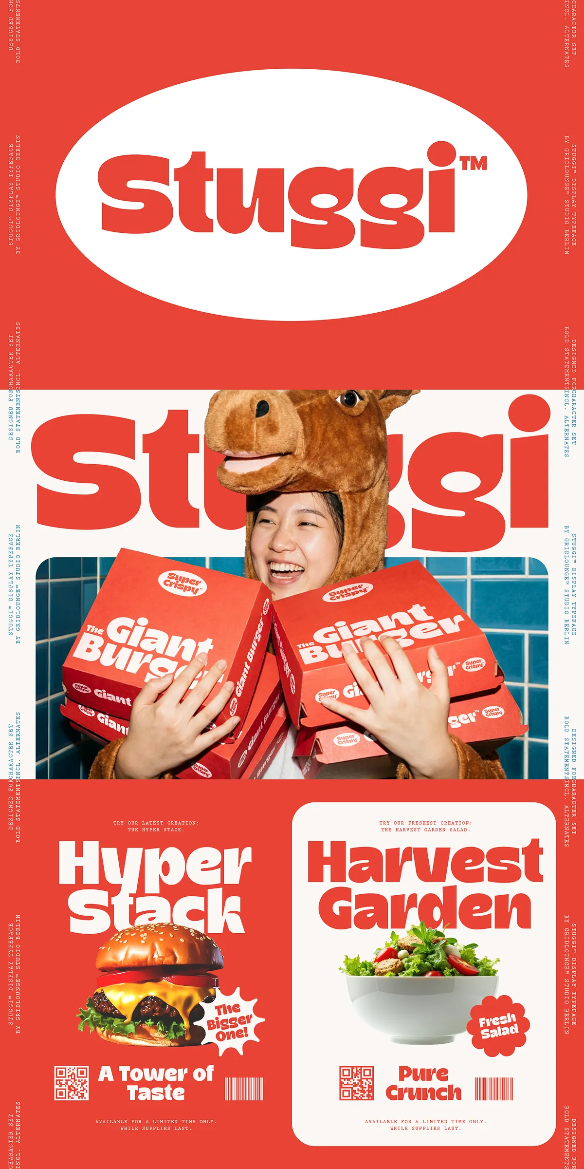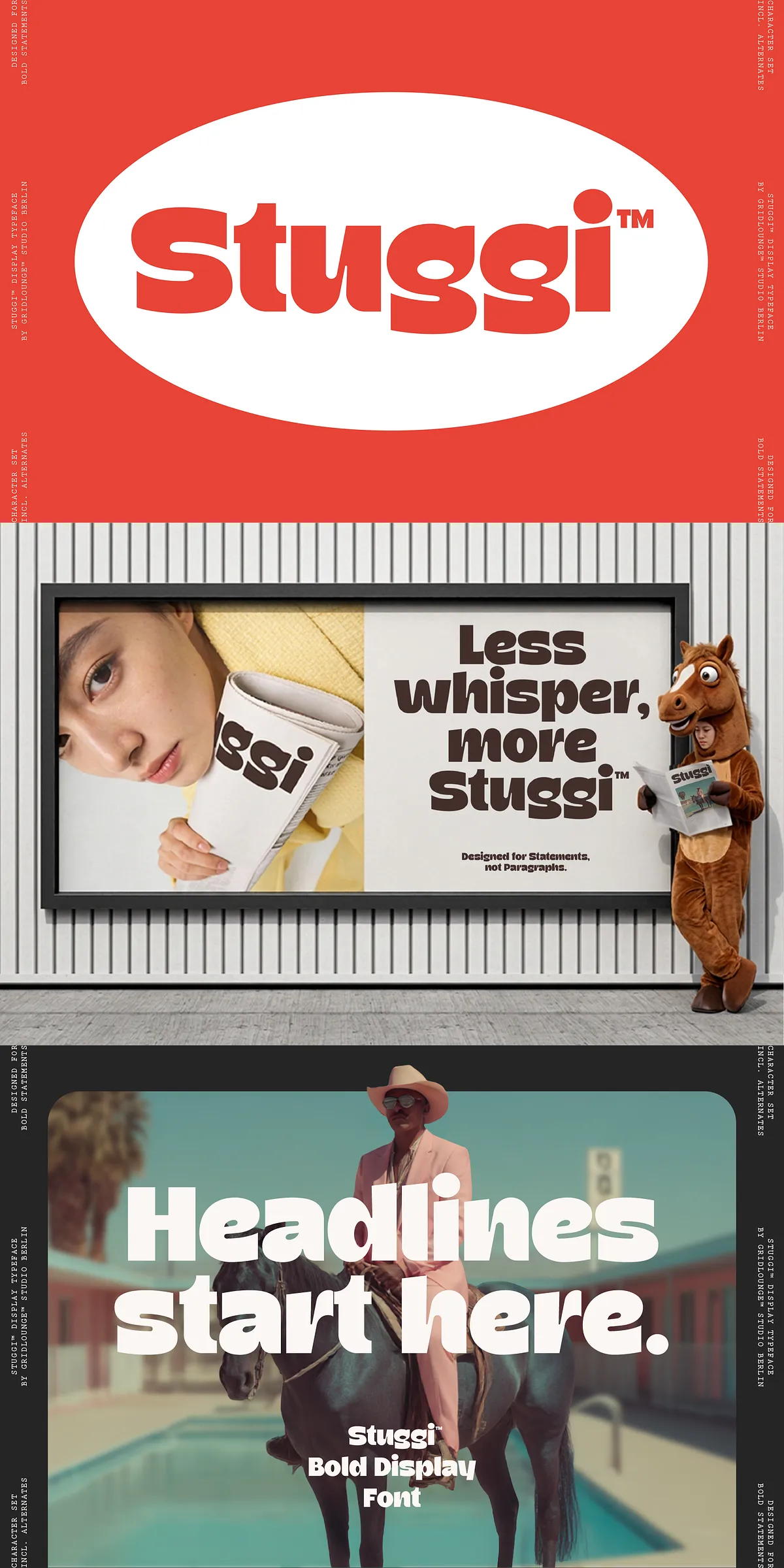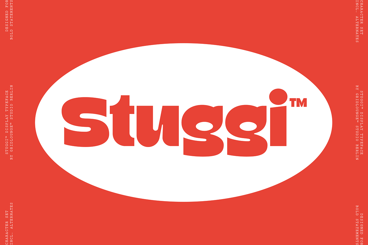

Meet Stuggi: a confident, bold display font that leaps off the page and grabs attention. Designed for makers who want their messages to land with personality and punch, Stuggi transforms ordinary headlines into memorable visual statements. From poster campaigns to product packaging, Stuggi delivers strong, readable letterforms that communicate energy and character. This description explains the font’s features, practical use cases, technical details, and implementation tips so you can apply Stuggi with confidence across print, digital, and branded materials.
Distinctive Handcrafted Characters That Demand Attention
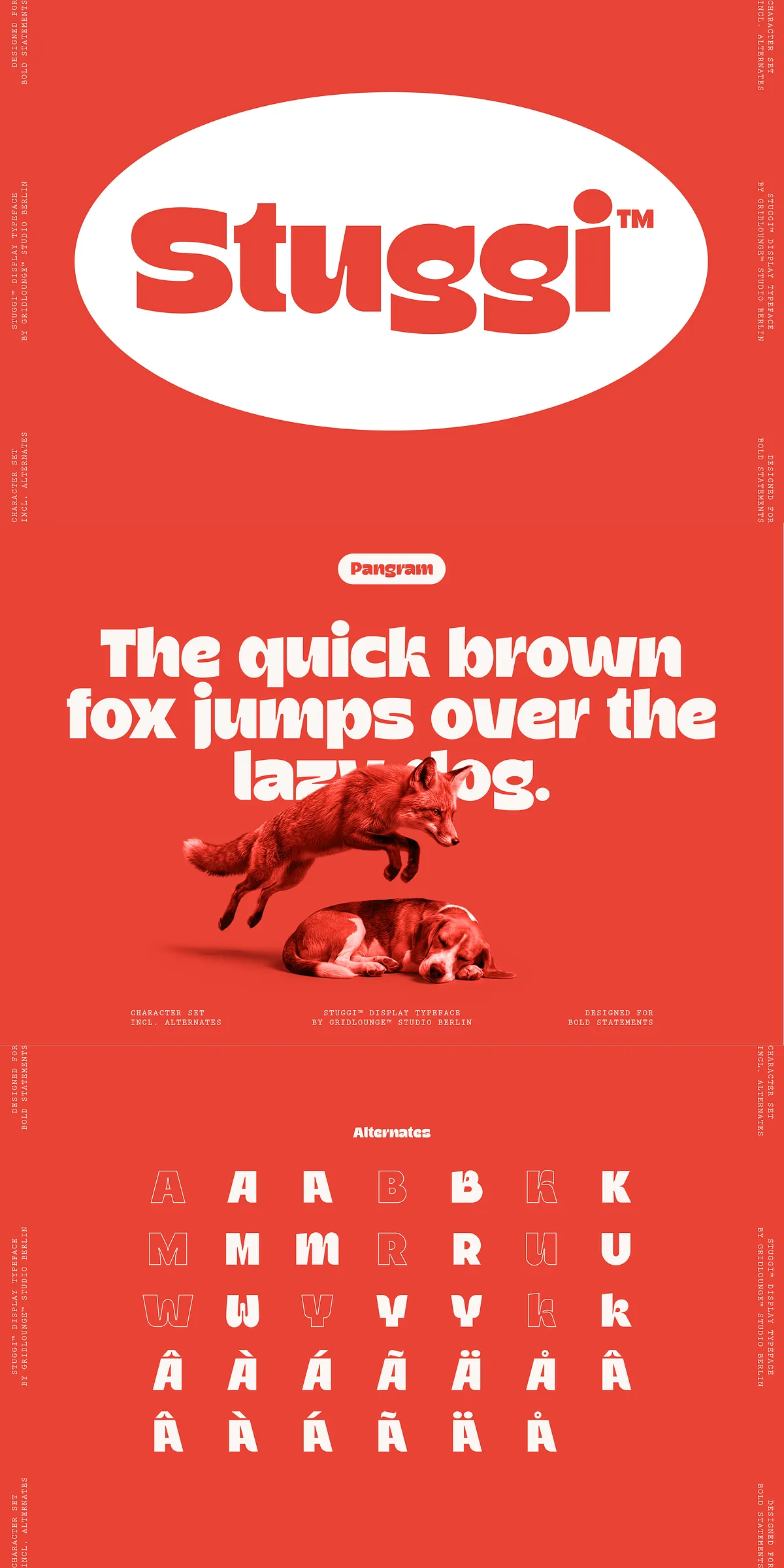
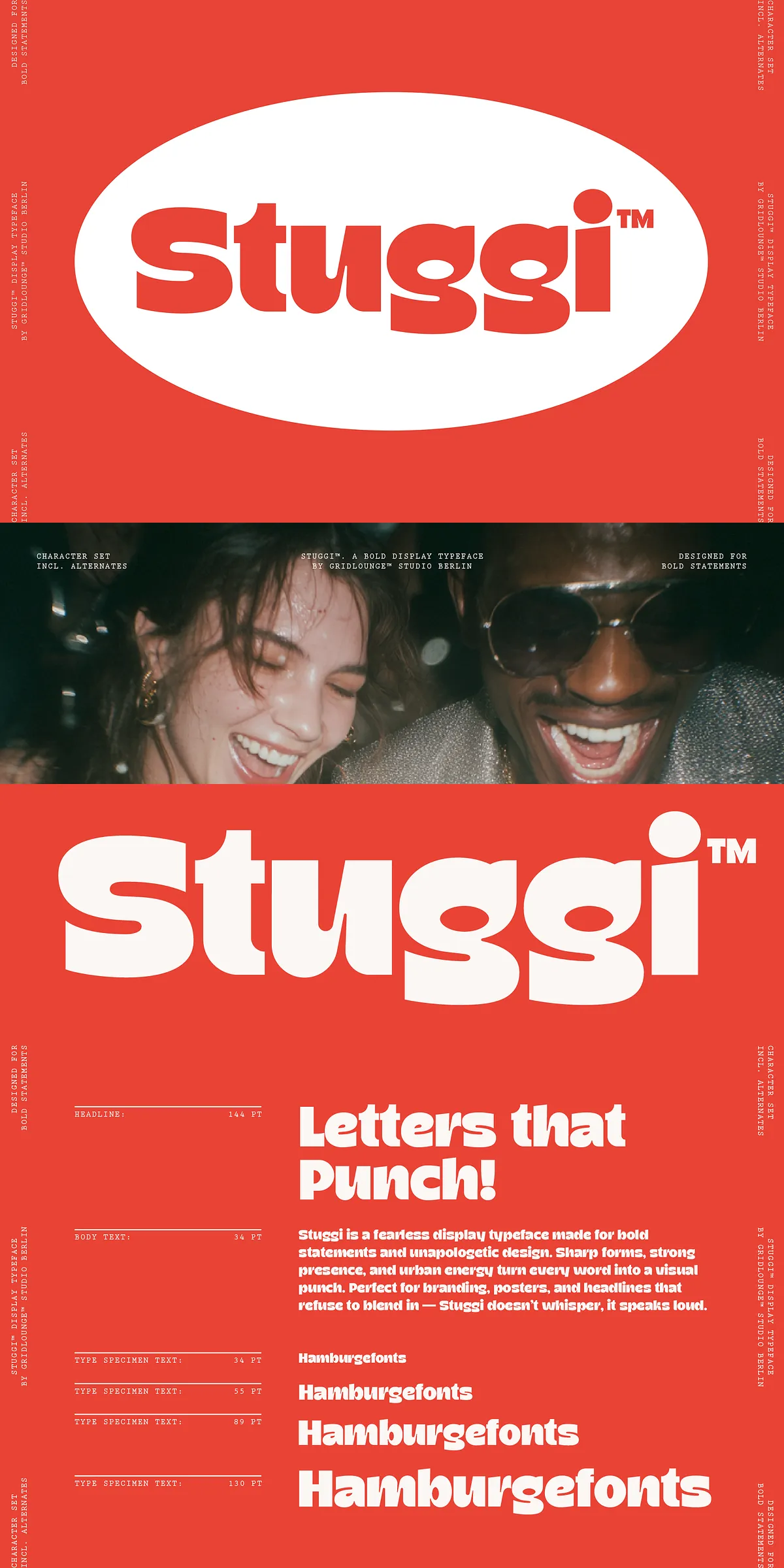
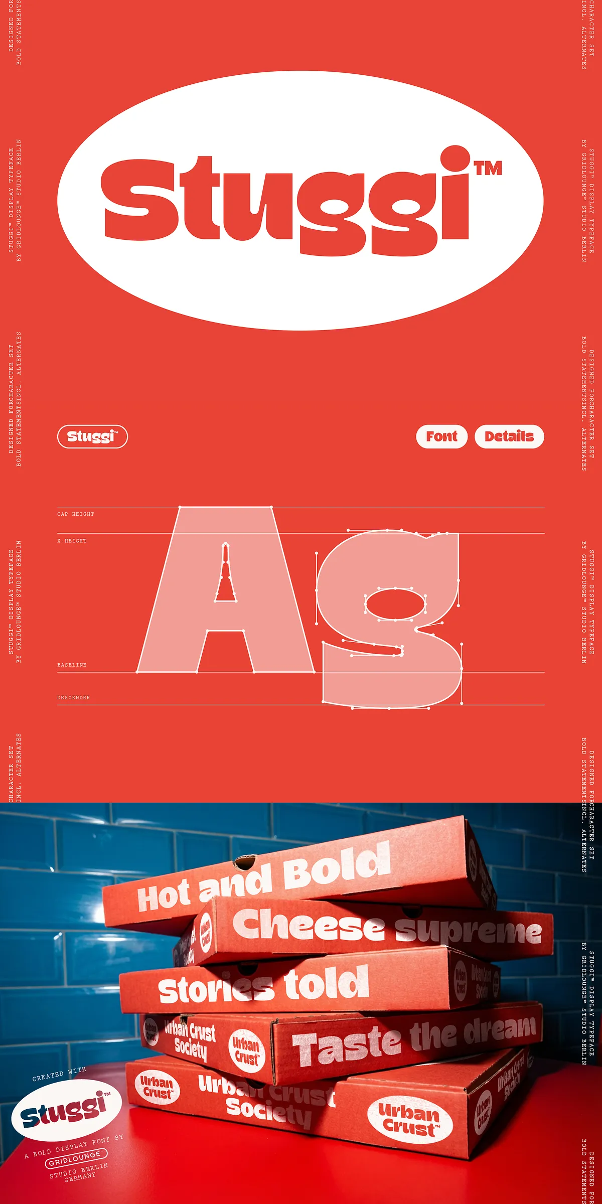
Stuggi combines a bold display skeleton with playful irregularities that feel handcrafted rather than mechanical. The typeface uses exaggerated proportions, confident strokes, and quirky alternate shapes to create a lively rhythm across words. Those subtle variations—slightly offset bowls, unexpected terminals, and decorative alternatives—add personality without sacrificing legibility at display sizes. Use Stuggi when you want typography that speaks loudly, feels approachable, and retains clarity at large scales.
Comprehensive Multilingual Support And Alternative Glyphs
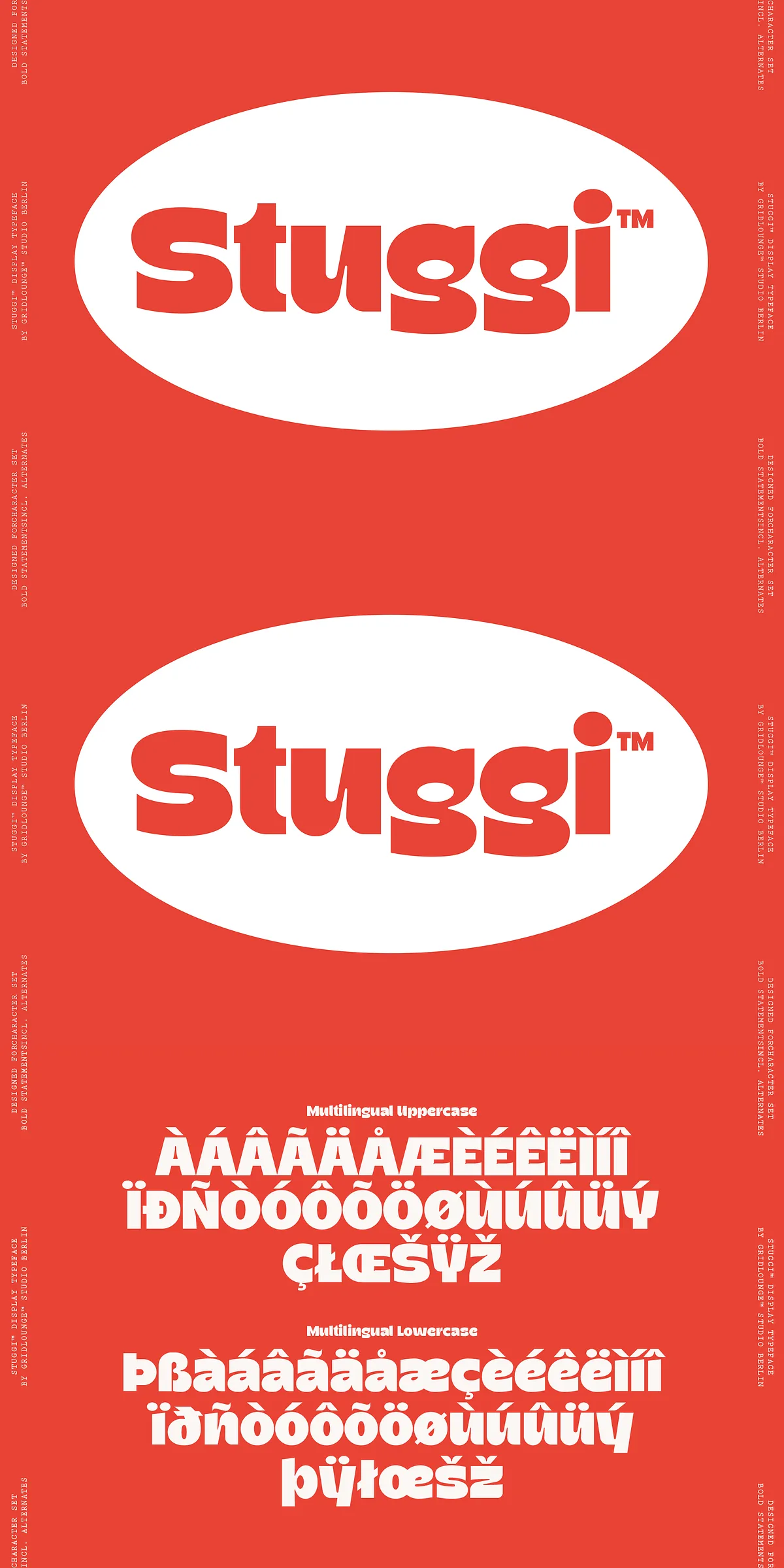
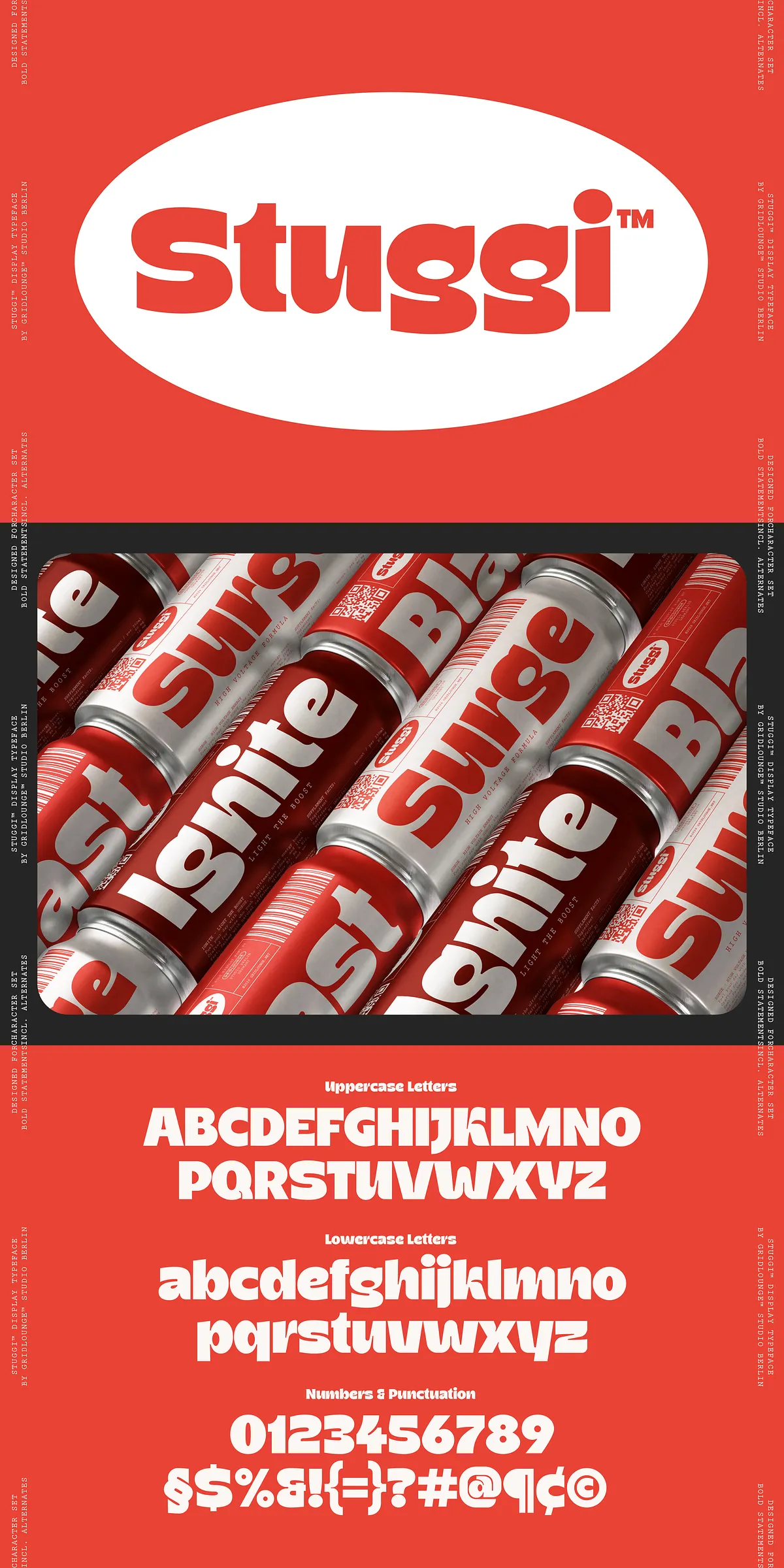
Stuggi ships with a full Latin character set, numbers, punctuation, and extended multilingual glyphs to support a wide range of languages. The font also includes a set of alternate characters that designers can swap to avoid repetition and craft unique wordmarks. These alternates expand creative possibilities: swap repeated letters for variant glyphs, build decorative letter pairs, and refine logos with custom letter combinations. The inclusion of multilingual glyphs ensures Stuggi performs across international campaigns and localized materials.
Practical Use Cases For High-Impact Design Work
Stuggi excels wherever attention matters. Use it for:
- Posters and event signage that must be seen from a distance.
- Branding and logo work that requires a bold, distinctive voice.
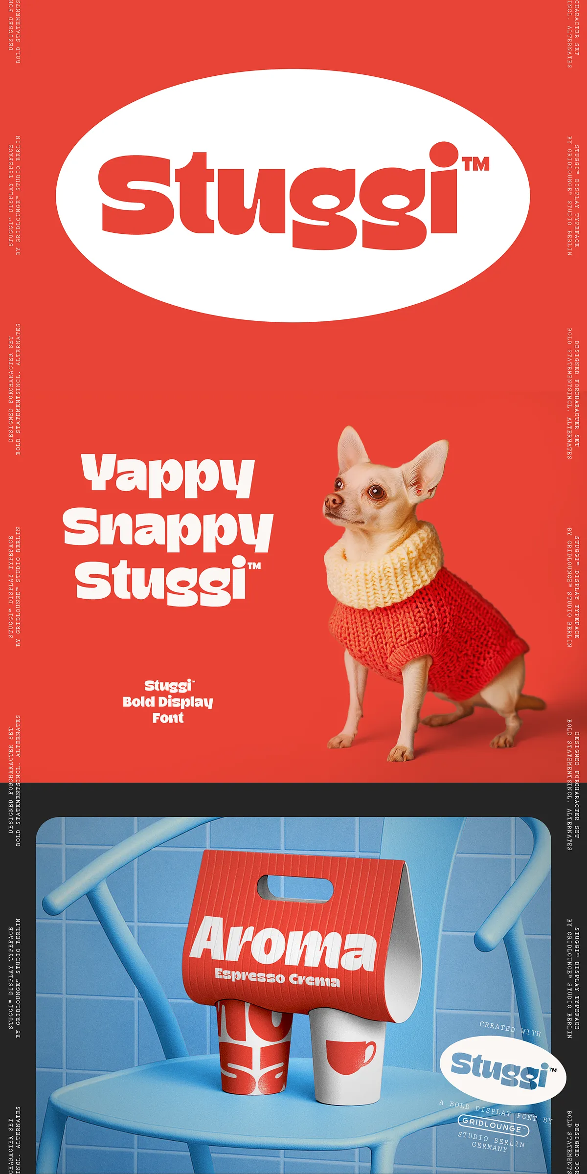
- Packaging and product labels that need immediate shelf presence.
- Social media headlines, hero images, and promotional banners designed to stop scrolling.
- Merchandise and apparel where bold lettering translates to wearable identity.
Because Stuggi reads strongly at display sizes, it makes headlines punchy while working in tandem with neutral body text to maintain hierarchy.
Compatibility With Design Software And Workflow Tips
Stuggi integrates seamlessly into common design environments: Adobe Illustrator, Photoshop, InDesign, Affinity Designer, Sketch, Figma, and other professional tools. To access alternate glyphs and stylistic sets, enable OpenType features within your application (for example, the OpenType or Glyphs panels in Adobe apps, or the Font/Type tool in Figma). When creating logos for vendors or printers who cannot embed fonts, convert your headline text to outlines to preserve appearance. For web use, generate WOFF and WOFF2 files and implement them using @font-face rules with font-display: swap for improved loading behavior.
Stylistic Alternatives, Ligatures, And How To Activate Them
Stuggi contains stylistic alternates and discretionary ligatures that enhance its handcrafted feel. Typical alternates allow you to vary repeated letters; ligatures smooth connections in specific letter pairs for decorative effect. To activate these features, turn on Stylistic Alternates, Discretionary Ligatures, or Stylistic Sets in your design software. In environments that do not support OpenType features, you can access alternates via a glyphs panel or by using dedicated font utilities to manually substitute characters.
Pairing Recommendations And Design Implementation Advice
Pair Stuggi with clean, neutral supporting typefaces to preserve hierarchy: a simple geometric sans or a restrained serif body face complements Stuggi’s boldness. Use generous tracking and large point sizes for headline treatments; when refining logotypes, apply tighter tracking and adjust kerning pairs for balance. Test color, contrast, and backgrounds—Stuggi’s strong forms perform best against simple photographic areas or solid colors that let shapes breathe.
Licensing Notes And Final Practical Considerations
Before publishing or embedding Stuggi, review the included license file to confirm permitted uses for desktop, web, app embedding, and product reproduction. For web deployments, optimize font subsets where possible to reduce file size while preserving necessary language support. Finally, test your files across platforms to ensure alternates and ligatures render as expected; in environments where OpenType features are limited, consider exporting high-resolution assets where appearance must remain consistent.
Stuggi transforms messages into confident, playful statements. Activate its alternates, explore its multilingual support, and let its bold personality elevate your creative work across headlines, brand identity, packaging, and social campaigns.