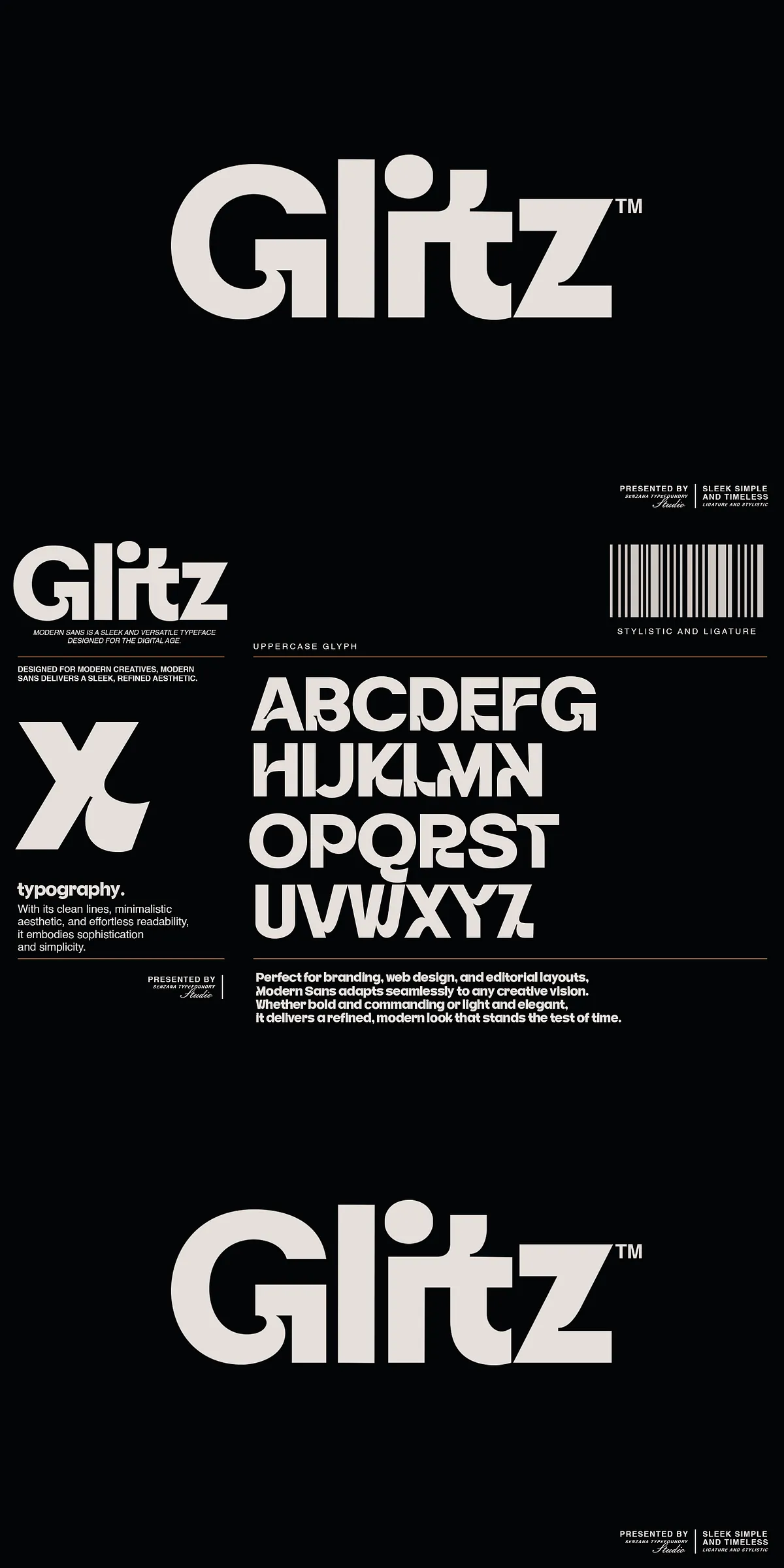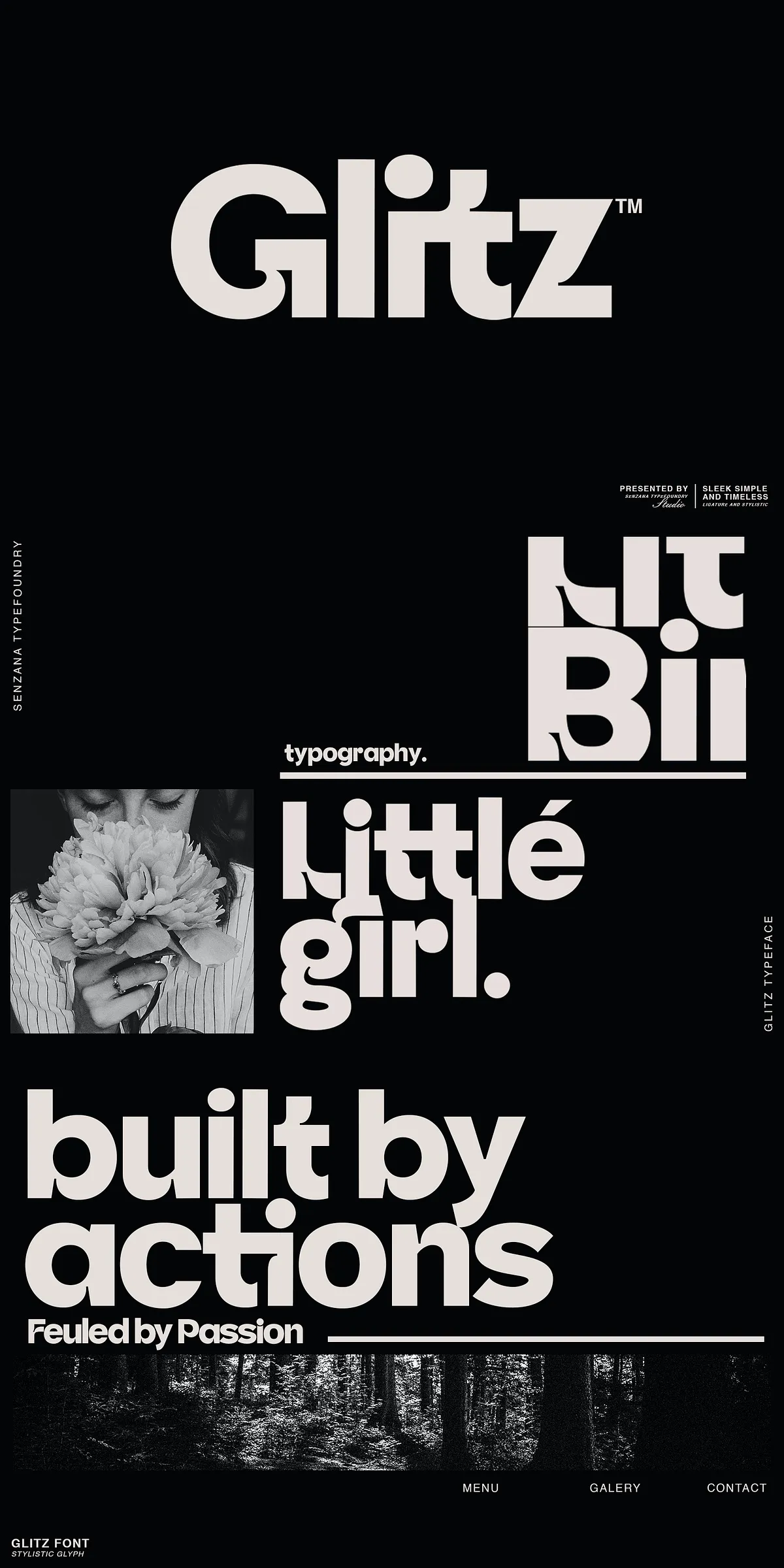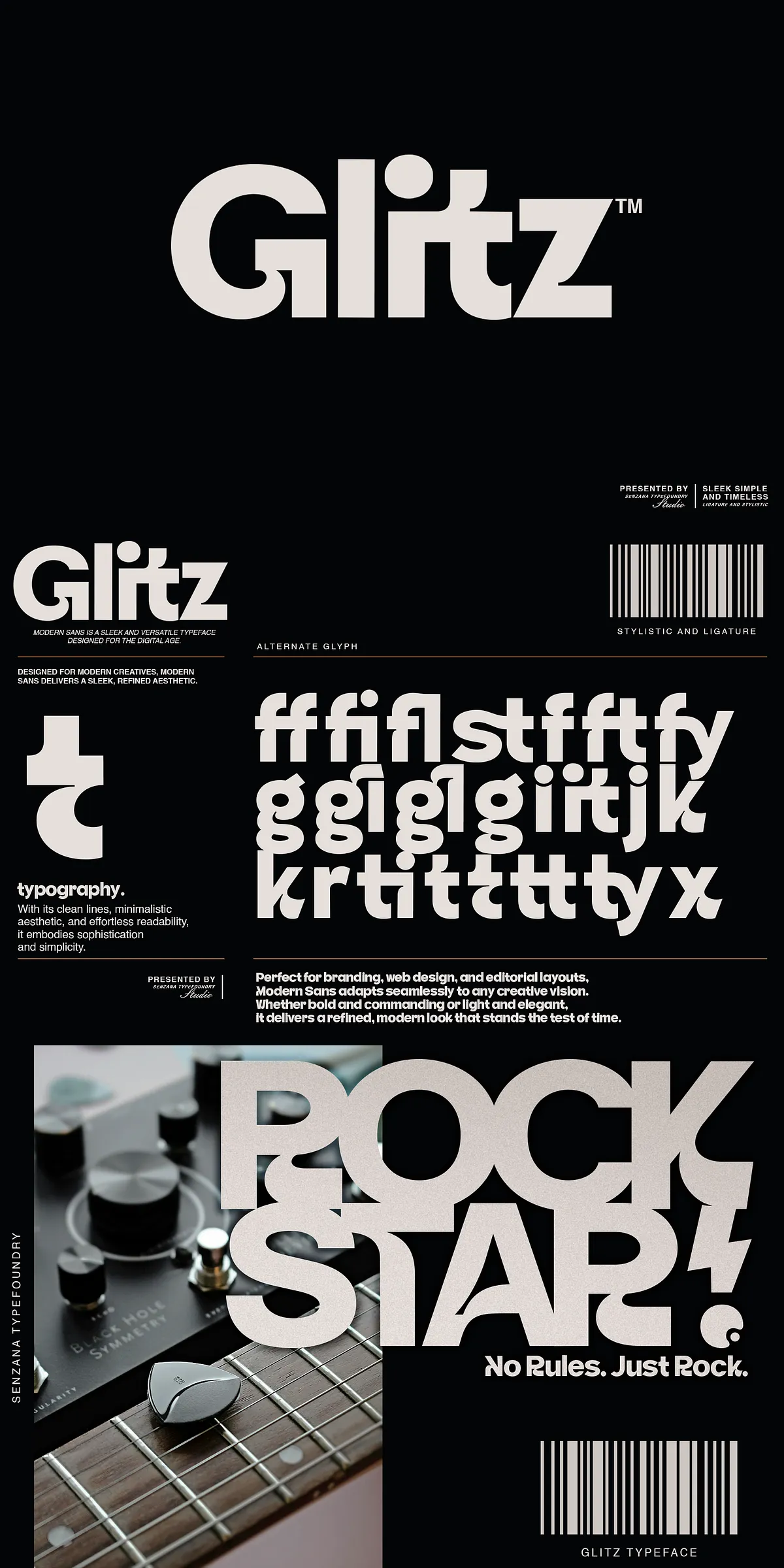

Glitz blends crisp geometry with subtle humanist curves to create a clean, modern voice that feels both professional and approachable. The typeface emphasizes balanced proportions, generous counters, and well-considered stroke terminals to deliver high legibility at display and text sizes. Glitz preserves simplicity while offering character: refined terminals and slight contrast give headlines personality without compromising a minimalist aesthetic. Designers seeking a confident yet understated look will find Glitz immediately usable for identity systems, editorial spreads, and web interfaces.
Comprehensive Character Set And Practical OpenType Functions
Included Character Sets And OpenType Enhancements For Designers
Glitz ships with a practical, production-ready glyph set that supports everyday multilingual requirements and professional typesetting:
- Uppercase and lowercase letters designed for balanced word color and consistent rhythm.
- Numerals and punctuation optimized for tabular and proportional contexts depending on layout needs.
- Ligatures that improve optical flow for specific letter combinations.
- Stylistic alternates to give brands subtle options for logotypes and headlines.
- Latin Simple coverage to support Western European languages and standard diacritics.
- Functional glyphs such as currency signs and basic mathematical symbols for broader utility.
File Formats, Delivery, And Integration Recommendations
How To Integrate Glitz Across Digital And Print Workflows
Glitz integrates smoothly into modern production pipelines. Use the OpenType OTF/TTF files in desktop applications for high-fidelity rendering, and deploy WOFF/WOFF2 webfonts to keep pages fast while preserving typographic quality. When preparing for print, export vector outlines for final artwork or when delivering to vendors who need reliable rendering across platforms. If you plan to use alternates or ligatures in environments that do not expose OpenType features, convert type to outlines for final output or provide companion PDF proofs to ensure visual fidelity.
Practical Usage Guidance And Design Pairing Suggestions
Best Practices For Headlines, Logos, And Editorial Layouts
Use Glitz as a primary display face for headlines and logotypes where its refined geometry can anchor the composition. Pair it with a neutral humanist or slab serif for body text to create contrast while maintaining harmony. For digital interfaces, reserve heavier weights for CTAs and lighter weights for subtle UI labels. Employ stylistic alternates and ligatures selectively to maintain readability—choose alternates for single-word marks or hero headlines rather than long runs of text. In editorial layouts, allow generous leading and measure to accentuate Glitz’s clean shapes and improve reading comfort.
Performance, Accessibility, And Readability Considerations
Ensuring Legibility And Inclusive Typography With Glitz
Glitz reads well across screen sizes when designers pair appropriate sizes and line lengths with strong contrast. For accessibility, keep body text in regular weights and avoid using intensely tight tracking for long paragraphs. Use the font’s clear letterforms for signage and wayfinding where quick recognition matters. When applying display or condensed styles for branding, maintain accessible contrast ratios and test captions or small UI elements in a plain weight to avoid degradation in legibility.
Licensing Guidance And Typical Use Cases For Glitz
Where Glitz Excels And How To License It Properly
Glitz excels in corporate identity, product packaging, editorial systems, web design, and high-end retail branding. Before embedding or distributing the font, confirm licensing terms for desktop, web, app, or merchandise usage with the vendor. Many releases include desktop OTF/TTF and web WOFF/WOFF2 packages; request extended licensing if you plan broad redistribution or high-volume merchandising. Keep a written record of the license scope to ensure compliant use across client projects and production partners.
Why Choose Glitz For Your Next Project
Choose Glitz when you want a modern sans-serif that communicates clarity, sophistication, and subtle individuality. It elevates logos, headlines, and editorial layouts through refined shapes and practical OpenType features. Glitz empowers designers with the balance of simplicity and distinctiveness—making designs feel intentional, professional, and contemporary across both digital and print environments.