Friend Regular delivers a warm, approachable voice while maintaining clarity and professional polish. Built as a tall rounded-serif, this typeface balances humanist curves with structured proportions to create a friendly but confident presence. Designers who want typography that speaks directly to audiences will find Friend Regular both expressive and dependable. Its tall x-height improves legibility at display sizes, and the rounded terminals soften the overall tone, producing headings and logotypes that feel inviting rather than severe.
Unlike cold geometric serifs, Friend Regular actively encourages readability and emotional connection. Use it to anchor headlines, craft standout logos, and give product packaging a human touch. The italic variant complements the upright style by introducing elegant motion and emphasis without losing the family’s core personality. When combined, the upright and italic forms create dynamic typographic rhythms that draw attention without overwhelming the layout.
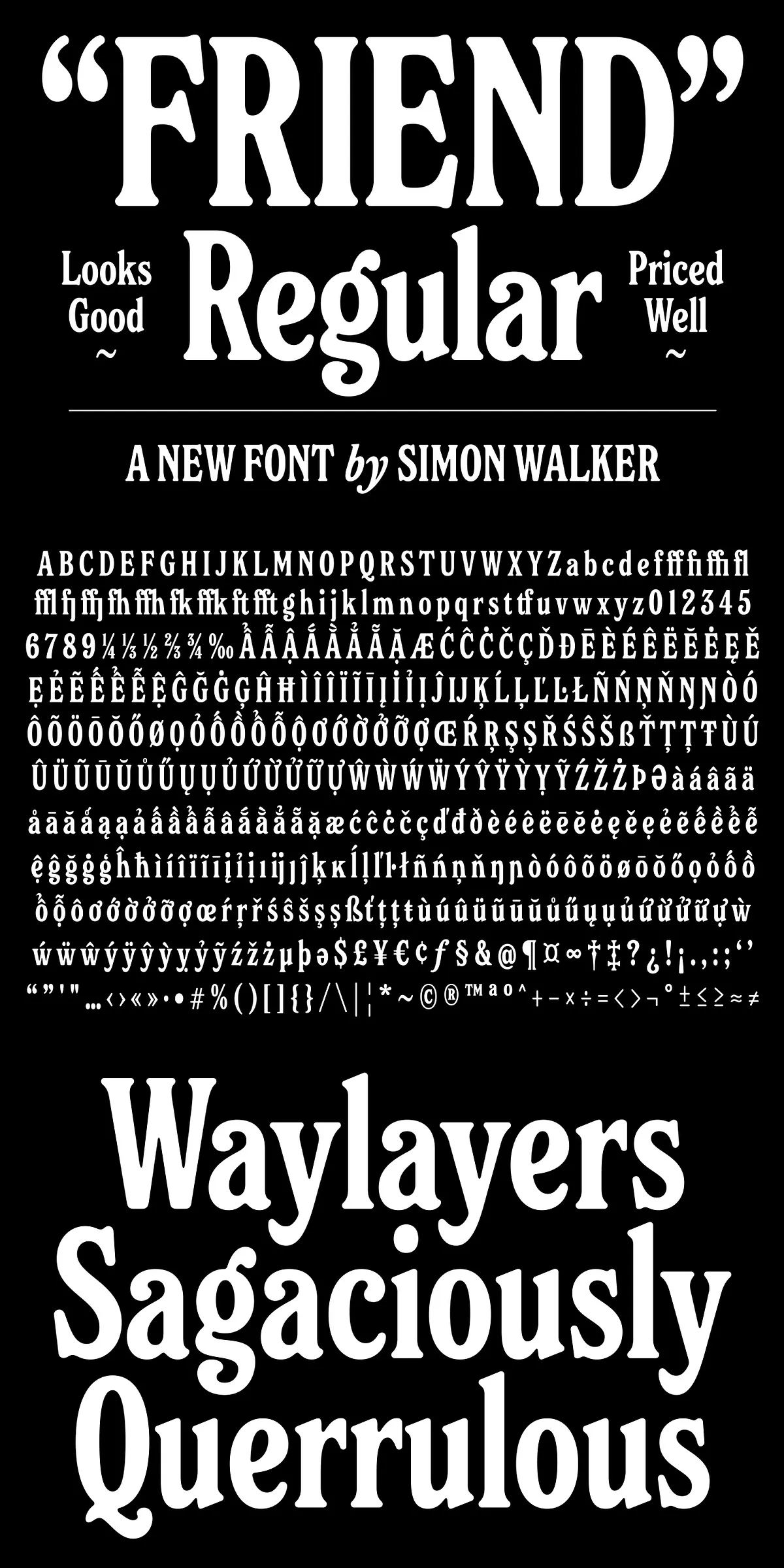
Distinctive Features That Make Friend Regular Work Harder
Friend Regular includes several intentional design choices that improve its performance across media. The generous x-height and open counters keep letterforms readable at larger display sizes and when used in short blocks of text such as quotes or callouts. The rounded terminals reduce visual tension and create smoother word shapes, which benefits both print and screen reading. Careful spacing and balanced stroke contrast ensure the font holds presence in bold headings while remaining graceful in lighter settings.
- Friendly, tall rounded-serifs for human-centered typography.
- Italic companion that adds graceful emphasis and motion.
- Clear letterforms optimized for display sizes and headlines.
- Well-considered spacing that supports both all-caps and mixed-case treatments.
Applications Where Friend Regular Performs Best In Practice
Brand Identity, Logos, And Packaging That Connect
Friend Regular actively enhances brand equity by conveying warmth and clarity. Use it for logos, wordmarks, and packaging to create approachable brand personalities. Pair a medium-weight upright for logotypes with the italic for submarks or secondary messaging to establish visual hierarchy. The rounded details work particularly well for lifestyle brands, cafes, boutiques, and wellness labels where human connection matters.
Editorial Headers, Pull Quotes, And Poster Typography That Command Attention
Designers can rely on Friend Regular to headline editorial spreads, posters, and social graphics. Its tall proportions allow for strong, compact headlines that maintain legibility across sizes. For pull quotes and feature highlights, the italic provides emphasis that feels organic and sophisticated. Because the design scales cleanly, you can confidently set it at large sizes without losing nuance.
Web Interfaces And Digital Experiences That Require Readability
Friend Regular adapts to digital environments thanks to clear counters and open shapes that render crisply on screens. Use it for hero headers, landing page titles, and in app interfaces where a friendly tone improves user perception. When used with responsive typography techniques, the typeface preserves its character from desktop down to mobile.
Technical Notes, File Formats, And Preview Resources
Friend Regular ships with an italic companion and includes complete character sets suitable for modern design workflows. The sample PDF demonstrates usage examples, full glyphs, and suggested pairings so you can evaluate the font before committing. Download the sample PDF to inspect kerning, letterform details, and sample compositions:
Download the Friend Regular sample PDF
Files typically include desktop formats (OTF/TTF) and web formats (WOFF/WOFF2) for seamless integration into print and digital projects. The design’s default spacing supports clean reading and balanced display; for condensed all-caps treatments, slightly tightened tracking delivers that modern, tightly-kerned look designers often seek.
Get Started With Friend Regular In Your Next Project Today
Friend Regular actively improves visual communication by combining friendly letterforms with reliable technical foundations. Whether you are building a brand identity, composing editorial layouts, or designing digital interfaces, this typeface gives your work a warm, professional voice. Preview the sample PDF linked above to see the full character set and practical examples of Friend Regular in action, then integrate the files into your design system to begin crafting readable, approachable typography that connects.