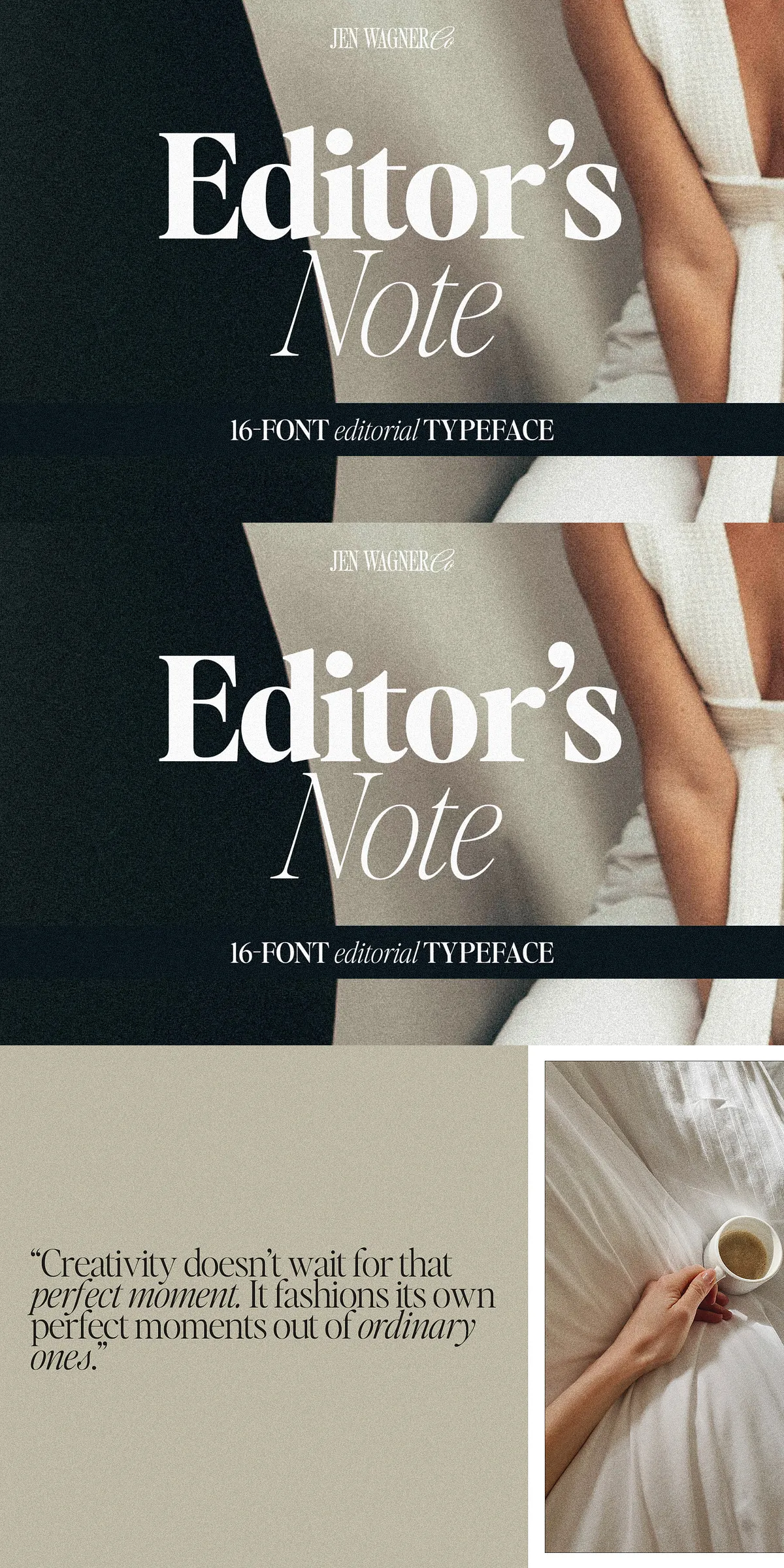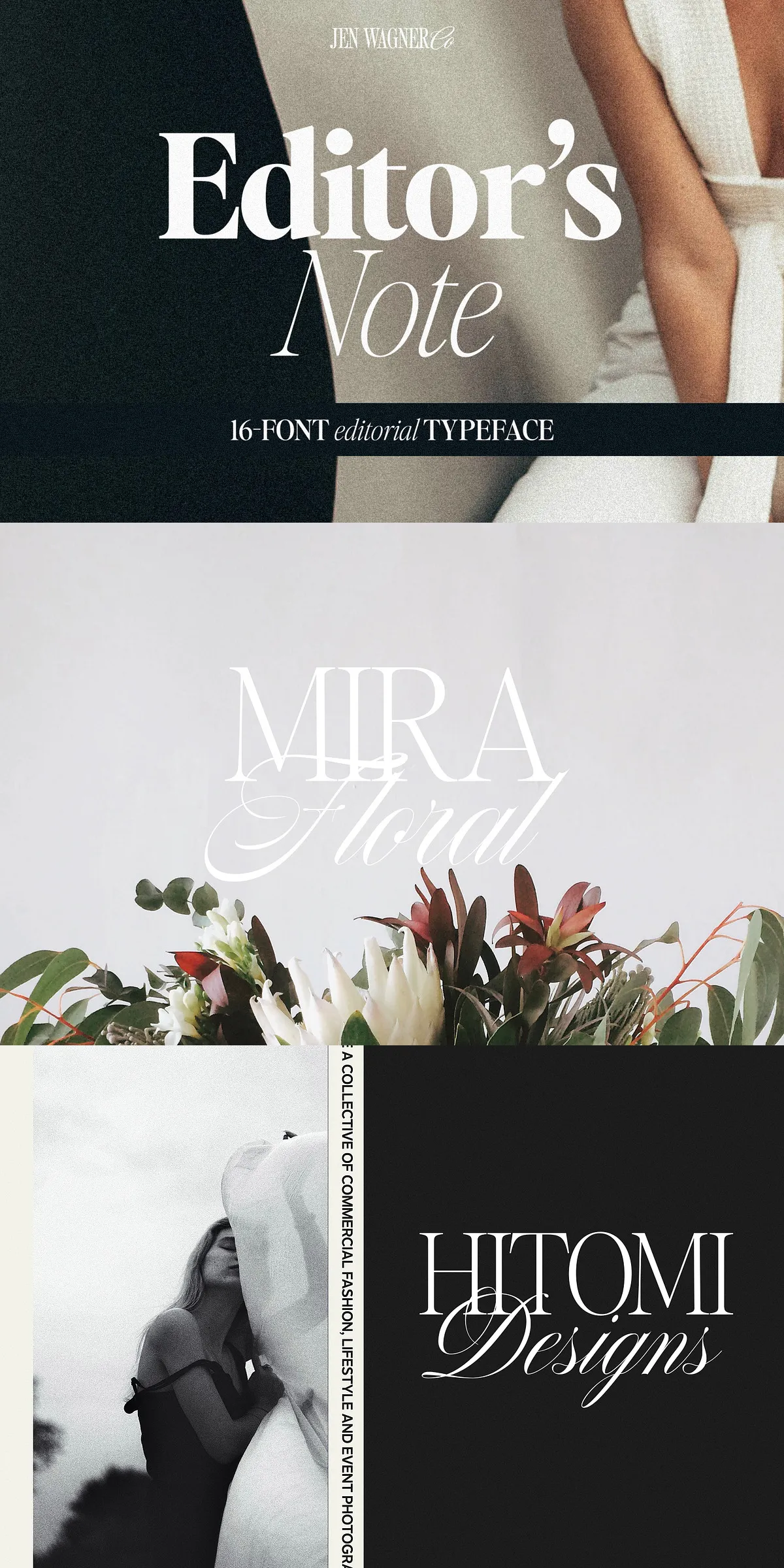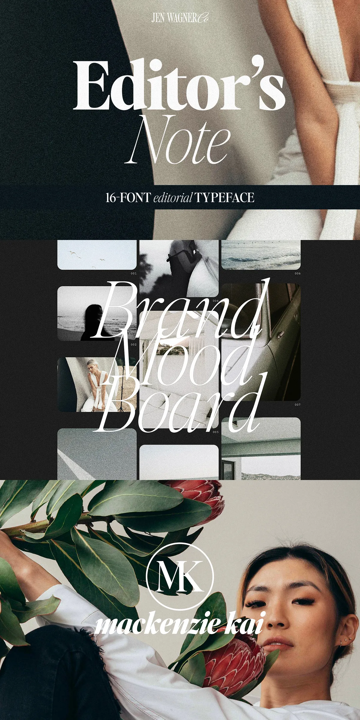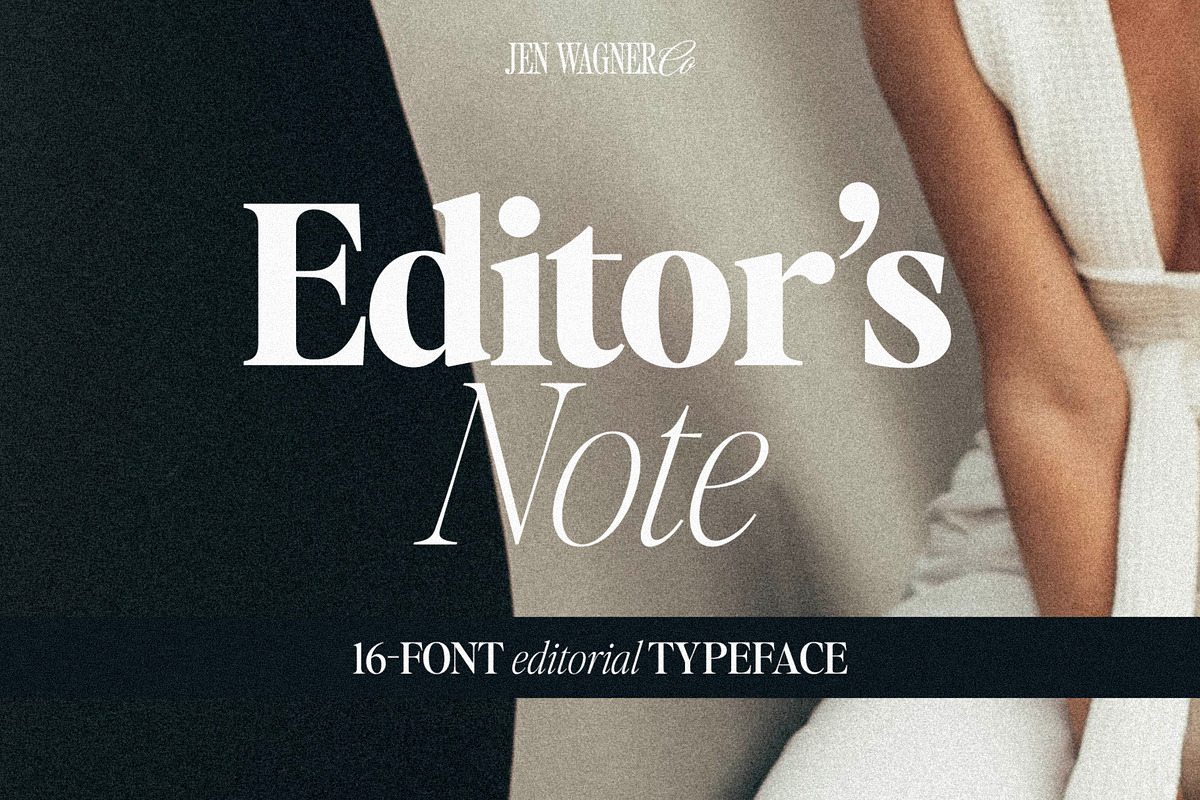
Dive into the future of clean, confident typography with the Editor’s Note FAMILY — a bold, expansive evolution of the iconic Editor’s Note typeface. This isn’t just a font update — it’s a full typographic revolution. Now featuring a total of 16 uniquely crafted weights — from delicate Hairline to powerful Bold — each variant is engineered to deliver precision, clarity, and editorial flair. Whether you’re crafting bold headlines, striking quotes, premium branding, or immersive digital content, the Editor’s Note FAMILY gives you unmatched control and creative freedom.
Where Minimalism Meets Maximum Impact
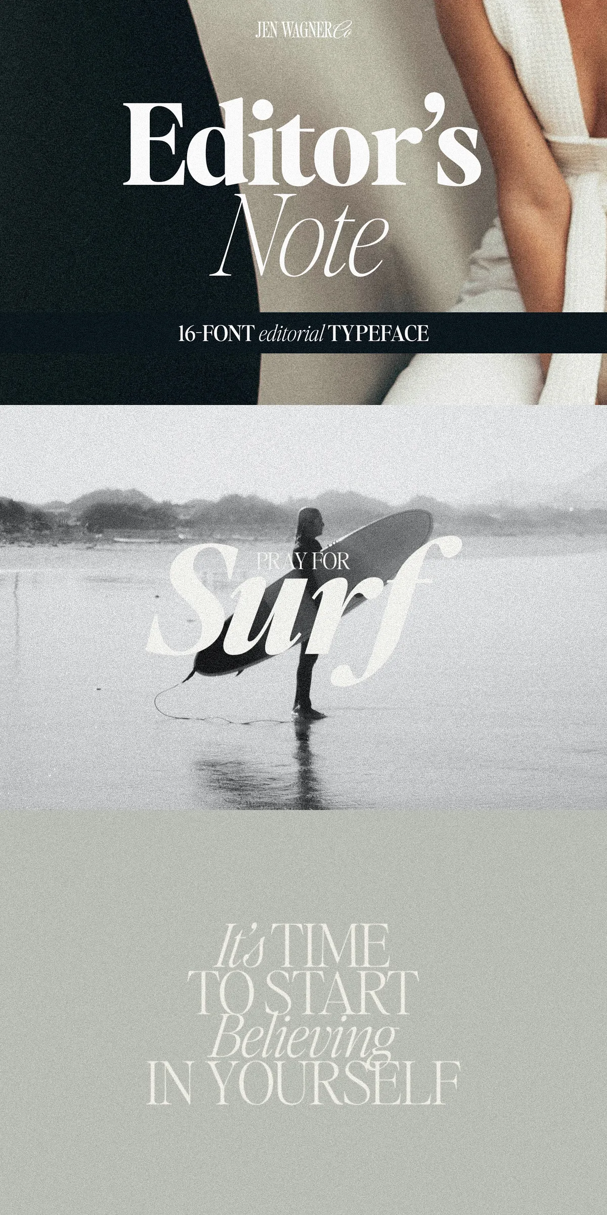
Design trends come and go — but timeless editorial style endures. The Editor’s Note FAMILY thrives on that truth. With its razor-sharp lines, tightly controlled curves, and perfectly balanced proportions, this typeface captures the quiet confidence of modern minimalism. Every character is meticulously designed to enhance readability without sacrificing personality. It’s not just clean — it’s intentional. It’s not just minimal — it’s meaningful.
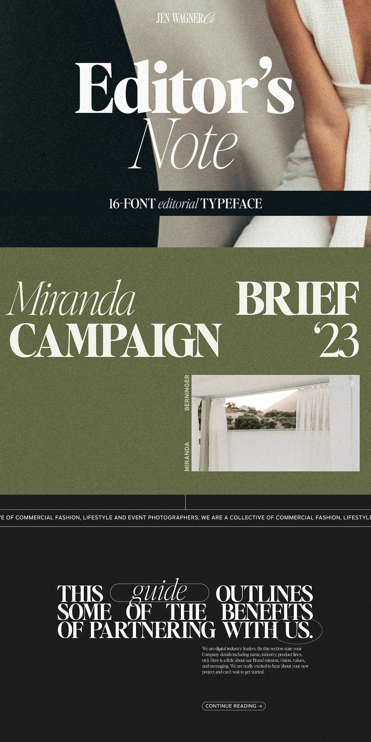
Use it in large display settings to command attention: headlines that stop the scroll, quotes that linger in the mind, calls to action that feel inevitable. The tight kerning and balanced spacing ensure visual harmony, even at extreme sizes. This is typography that doesn’t shout — it speaks with undeniable authority.
Master the Art of Letter Spacing
One of the defining features of the Editor’s Note FAMILY is its intentional letter spacing. Designed for clean, elegant reading, the default spacing is tailored for optimal flow in body text and moderate headlines. But want that daring, modern, all-caps look popularized in digital design? No problem. Simply tighten the tracking to between -20 and -35 to achieve that sleek, bold, contemporary aesthetic seen in top-tier design publications and social media visuals.
Pro tip: Pair the Regular weight with the Italic in contrasting text blocks — perfect for quotes, pull quotes, or narrative highlights. Use the Bold and Semibold for maximum impact in branding, product titles, or social media graphics.
Precisely Engineered for Every Project
The Editor’s Note FAMILY isn’t just beautiful — it’s built for performance. Every weight comes in both Regular and Italic variants, with full support for uppercase and lowercase letters, numerals, punctuation, and diacritics. It also includes robust multilingual support, covering Western European, Central European, and extended Latin-based languages. Ideal for global brands, multilingual publications, and international design agencies.
Key features include:
- 16 Distinct Weights: Hairline, Thin, Extralight, Light, Regular, Medium, Semibold, Bold — each weight tuned for specific uses and visual hierarchy.
- Full Italic Variants: Add rhythm, motion, and elegance through fluid, naturally swaying italics.
- Advanced Typographic Tools: Includes ligatures, stylistic sets, and OpenType features for seamless integration into high-end design workflows.
- Multiple File Formats: Delivered in OTF, TTF, WOFF, and WOFF2 formats — ensuring compatibility across Adobe Creative Cloud, Figma, Sketch, web platforms, and print production systems.
- High-Resolution Rendering: Optimized for sharp display on screens, tablets, and print, regardless of size or resolution.
Built to Transform Your Creative Vision
From digital design to print branding, from editorial layouts to social content, the Editor’s Note FAMILY transforms how your messages are received.
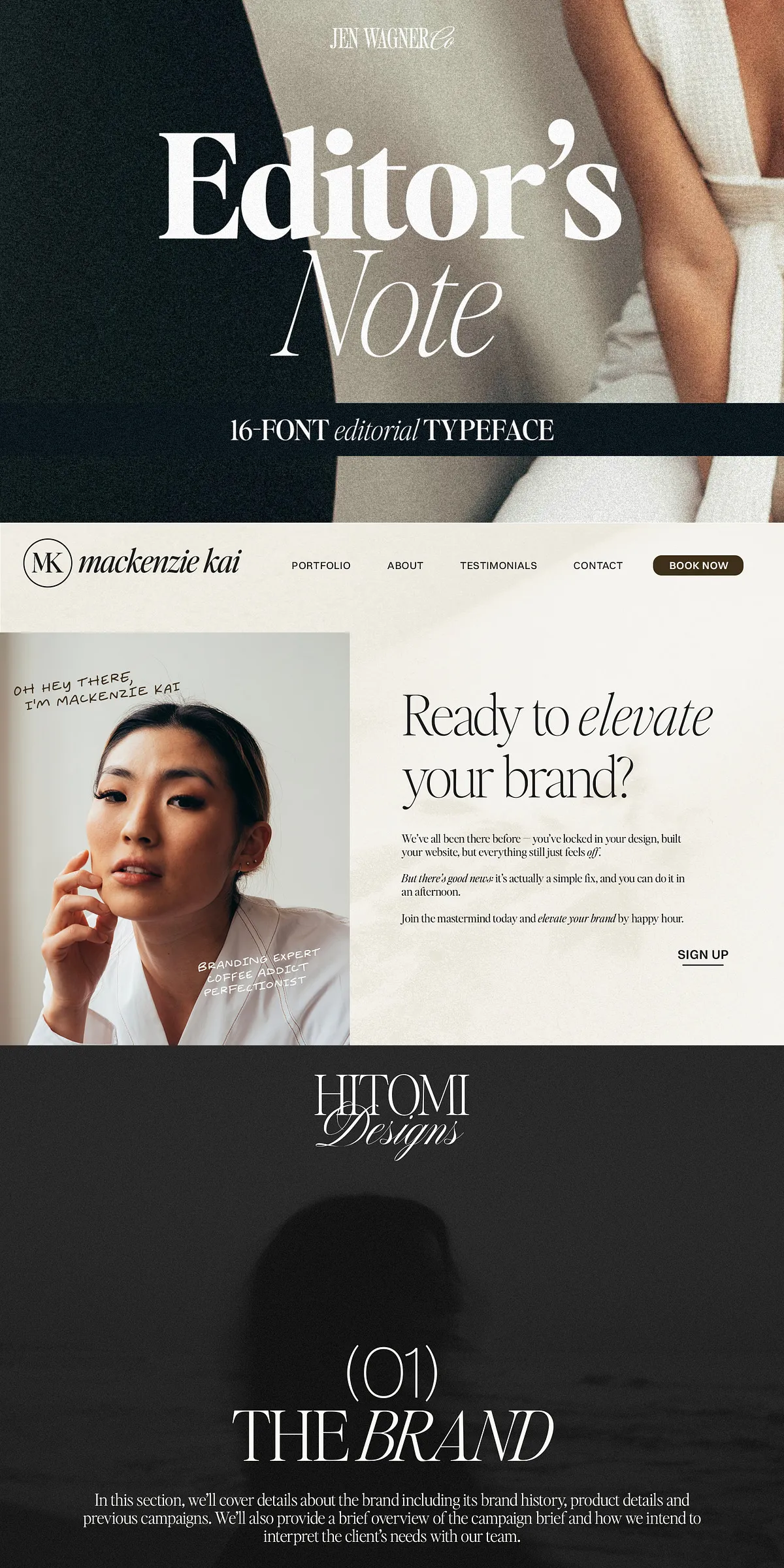
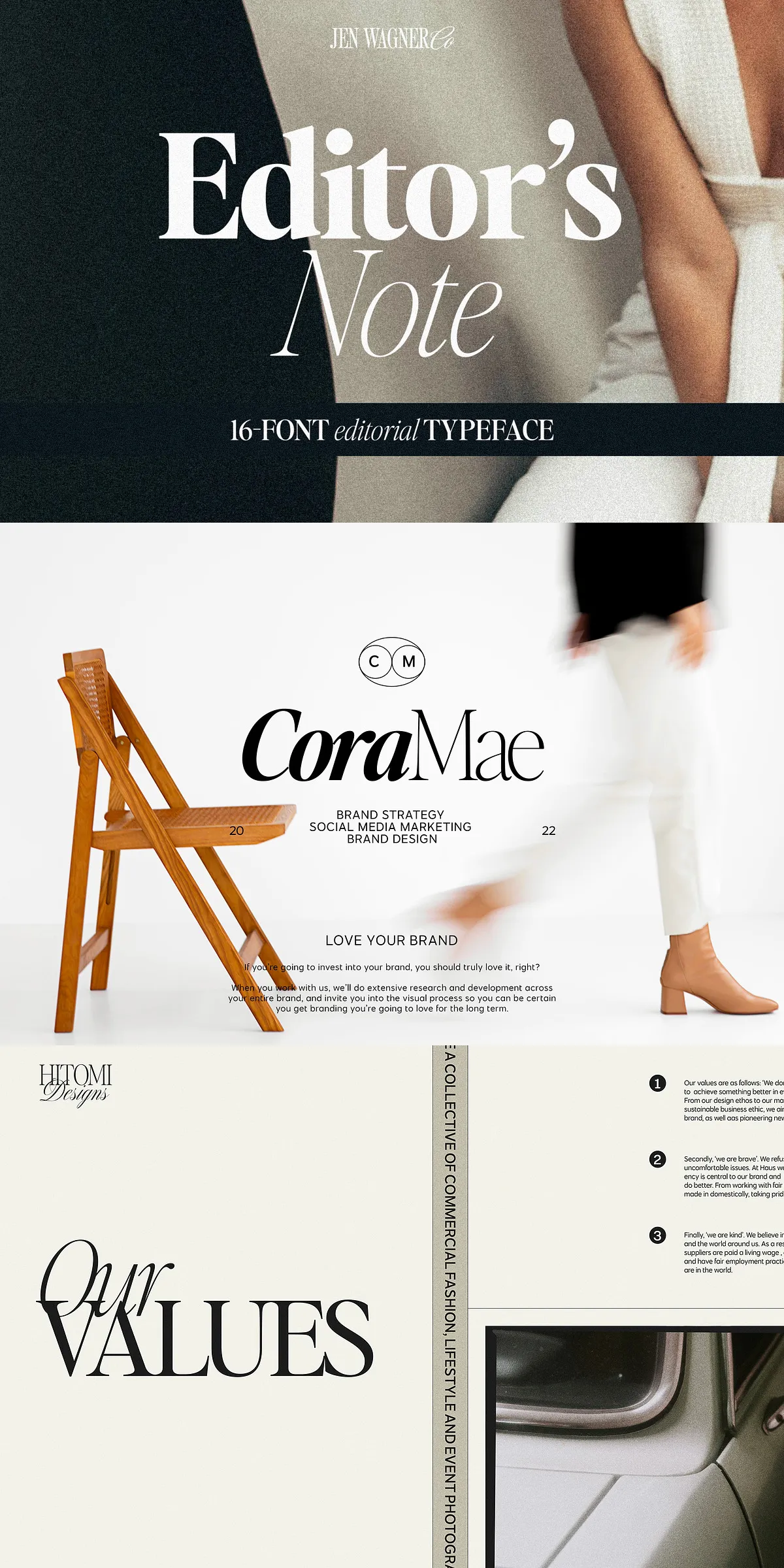
- Branding & Logos: Create identities that feel modern, minimalist, and instantly recognizable. Its clean structure ensures scalability and clarity at any size.
- Magazines & Publications: Design chapter headings, bylines, and article titles with a sense of order, clarity, and sophistication.
- Web & UI Design: Use with WOFF2 for fast loading and smooth rendering. Ideal for menus, hero sections, and interactive elements where clarity and speed matter.
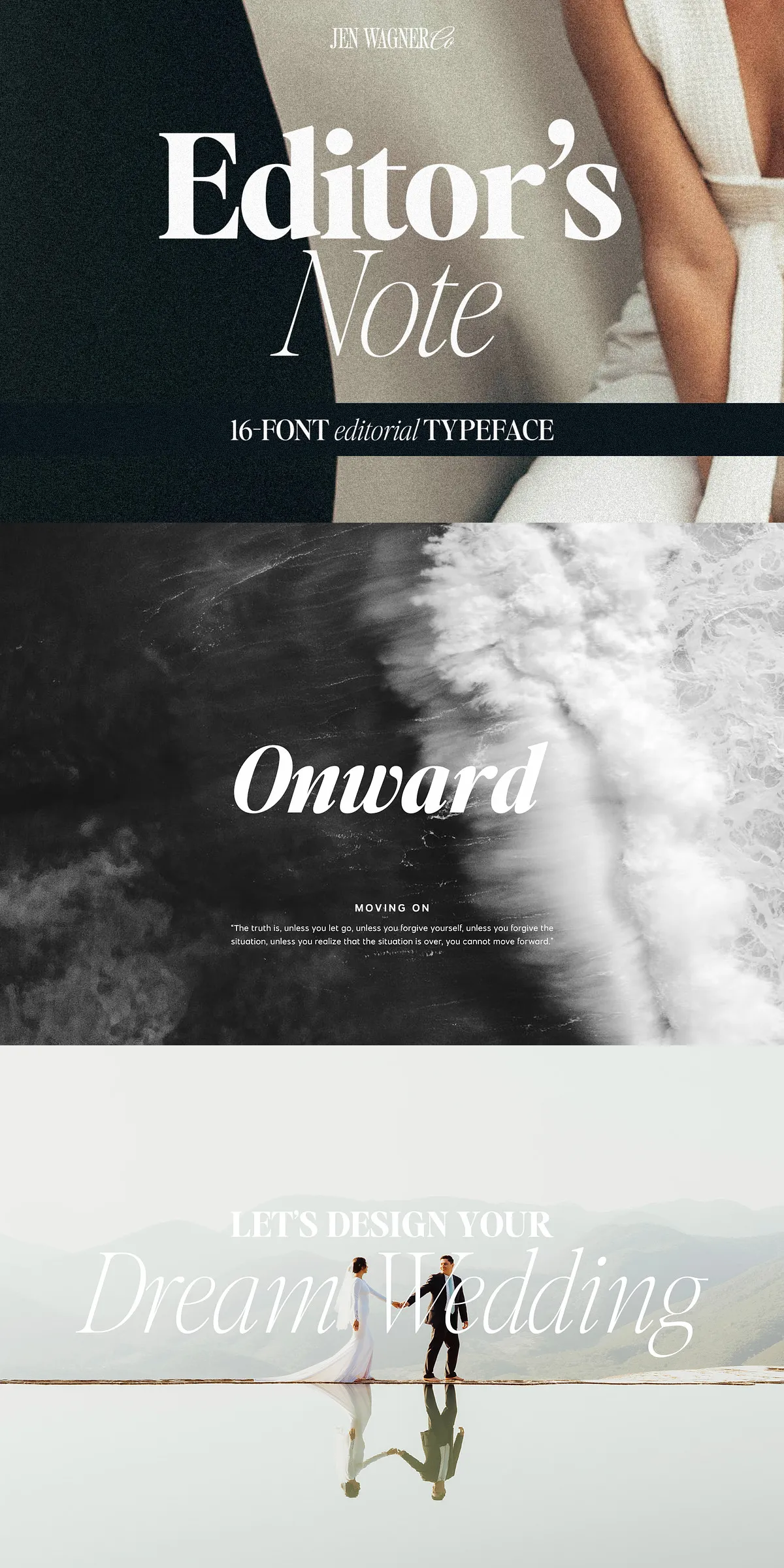
- Social Media & Motion Graphics: Produce eye-catching quotes, story elements, and title cards with a premium, editorial-grade look.
Typography That Doesn’t Just Speak — It Commands
With the Editor’s Note FAMILY, your words gain power. You’re not just choosing a font — you’re selecting a design philosophy. This is typeface design that balances function and beauty, precision and emotion. It’s the difference between blending in and standing out.
Let your message be clear. Let your brand be bold. Let your design be timeless.
Download the Editor’s Note FAMILY today and turn every sentence into a statement of style, structure, and confidence.