Introducing Quarterly — a vibrant, handcrafted font family that dances between the whimsy of organic handwriting and the refinement of classical typographic tradition. Designed for creators who refuse to choose between fun and finesse, Quarterly brings bold character, expressive strokes, and creative flexibility to every project you work on.
Unleash Creative Energy with Every Letter
Quarterly was born from a desire to capture the soul of hand-drawn lettering without sacrificing readability or sophistication. Each glyph carries subtle imperfections — intentionally irregular stroke widths, dynamic curves, and expressive serifs — all of which contribute to a live, natural feel. Yet, beneath this playful surface lies a strong, deliberate structure that ensures consistency and balance across all weights and sizes.
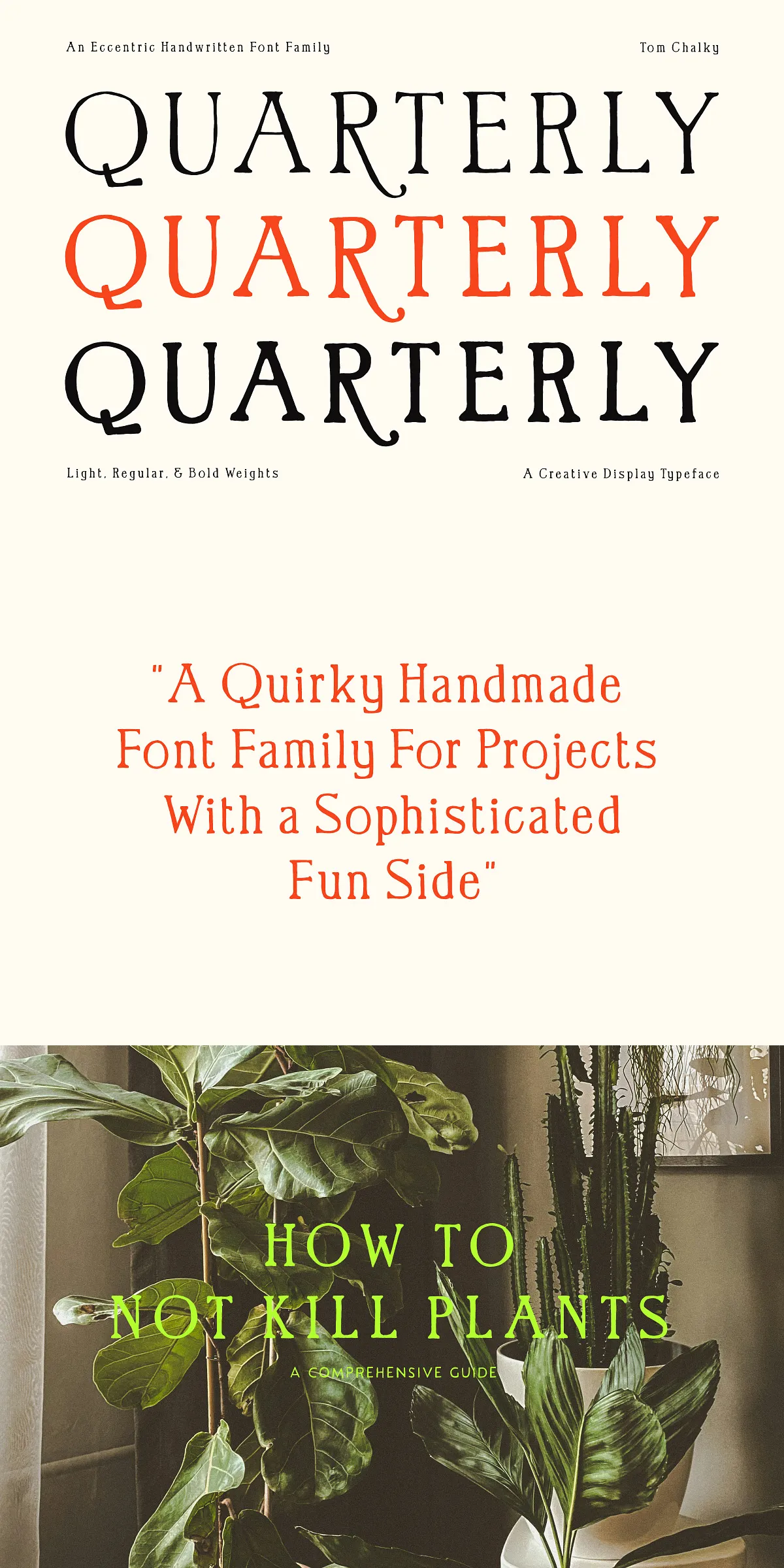
This isn’t just a casual script. Quarterly is precision-designed to be a serious tool for designers who want to elevate their work with authenticity and charm. Whether you’re designing a boutique brand identity, a limited-edition book cover, or a seasonal campaign, Quarterly delivers personality with purpose.
Three Bold Weights, Infinite Possibilities
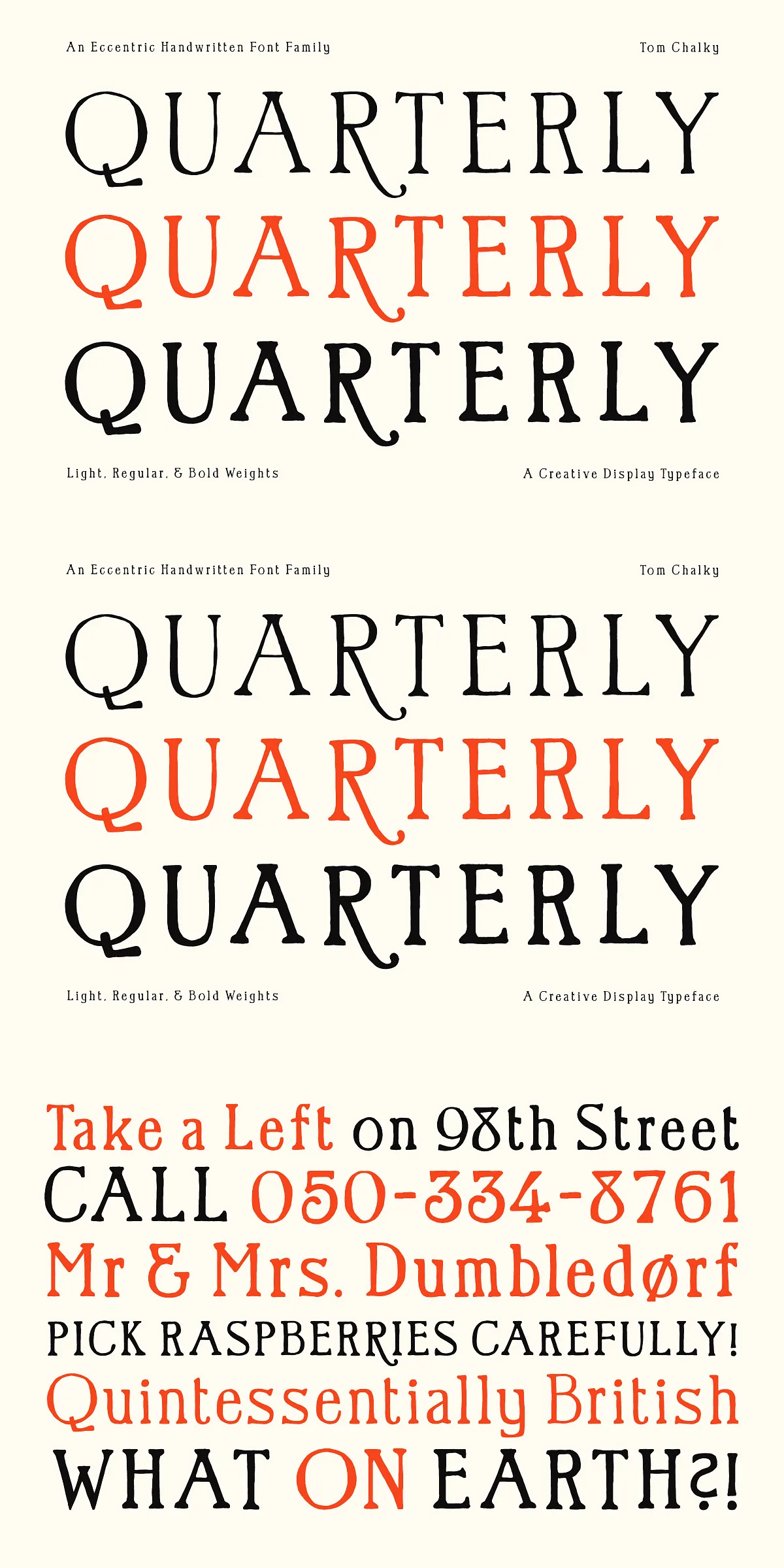
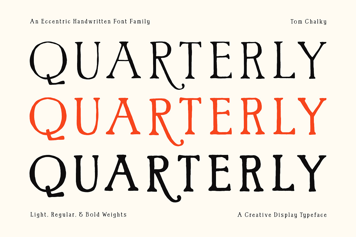
Quarterly comes in three distinct weights — Light, Regular, and Bold — each tailored to different visual needs and design contexts:
- Light: Ideal for delicate headings, journaling, or subtle accents in editorial layouts.
- Regular: The workhorse of the family — perfect for body text, invitations, product labels, and clean branding.
- Bold: Command attention with dramatic headlines, poster designs, or standout title treatments.
These weights are designed to work together harmoniously, offering scalable contrast and visual rhythm when used in combination.
Rich Character Support for Global Creativity
Designed with modern projects in mind, Quarterly supports Latin 1 glyphs, giving you full access to diacritics and special characters needed for French, German, Spanish, Scandinavian, and other Western European languages. This makes it a practical choice for international branding, multilingual publications, and creative agencies working across borders.
Smart Typographic Tools Built-In
Quarterly includes a full set of fraction numerals — small, beautifully proportioned numbers designed to integrate seamlessly into text. Use them to create elegant recipe cards, vintage-style labels, or sophisticated data graphics — without breaking the flow of your design.
These fraction glyphs are standard OpenType features, so they’re accessible directly in Adobe InDesign, Illustrator, Photoshop, Affinity Designer, Figma, and other professional tools — no extra work needed.
Creative Applications That Inspire
Quarterly was built to shine in real-world design scenarios. Here’s how top creators are using it:
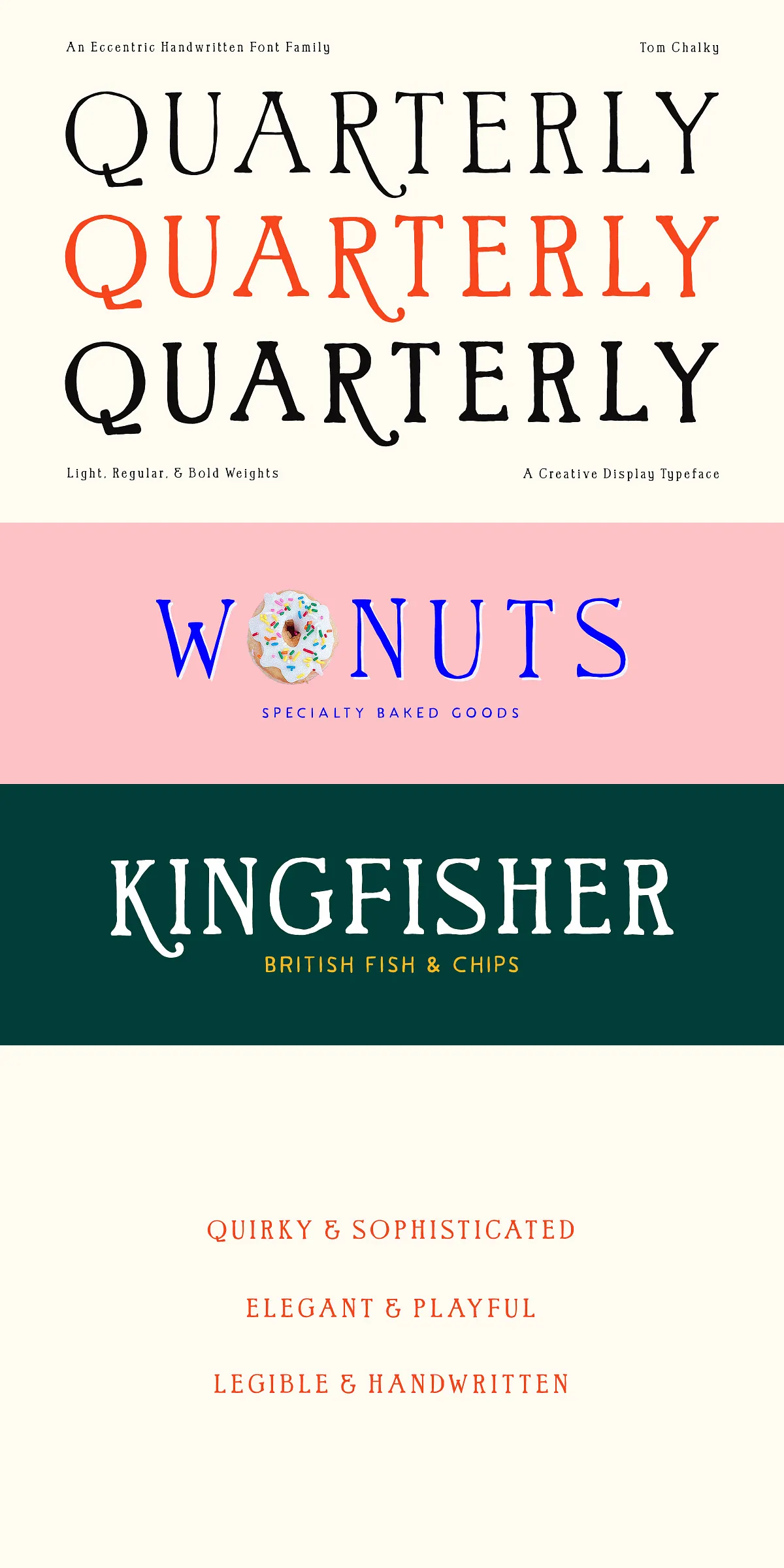
- Branding & Identity Design: Create memorable logos and brand systems with a human touch that stands out in a digital landscape.
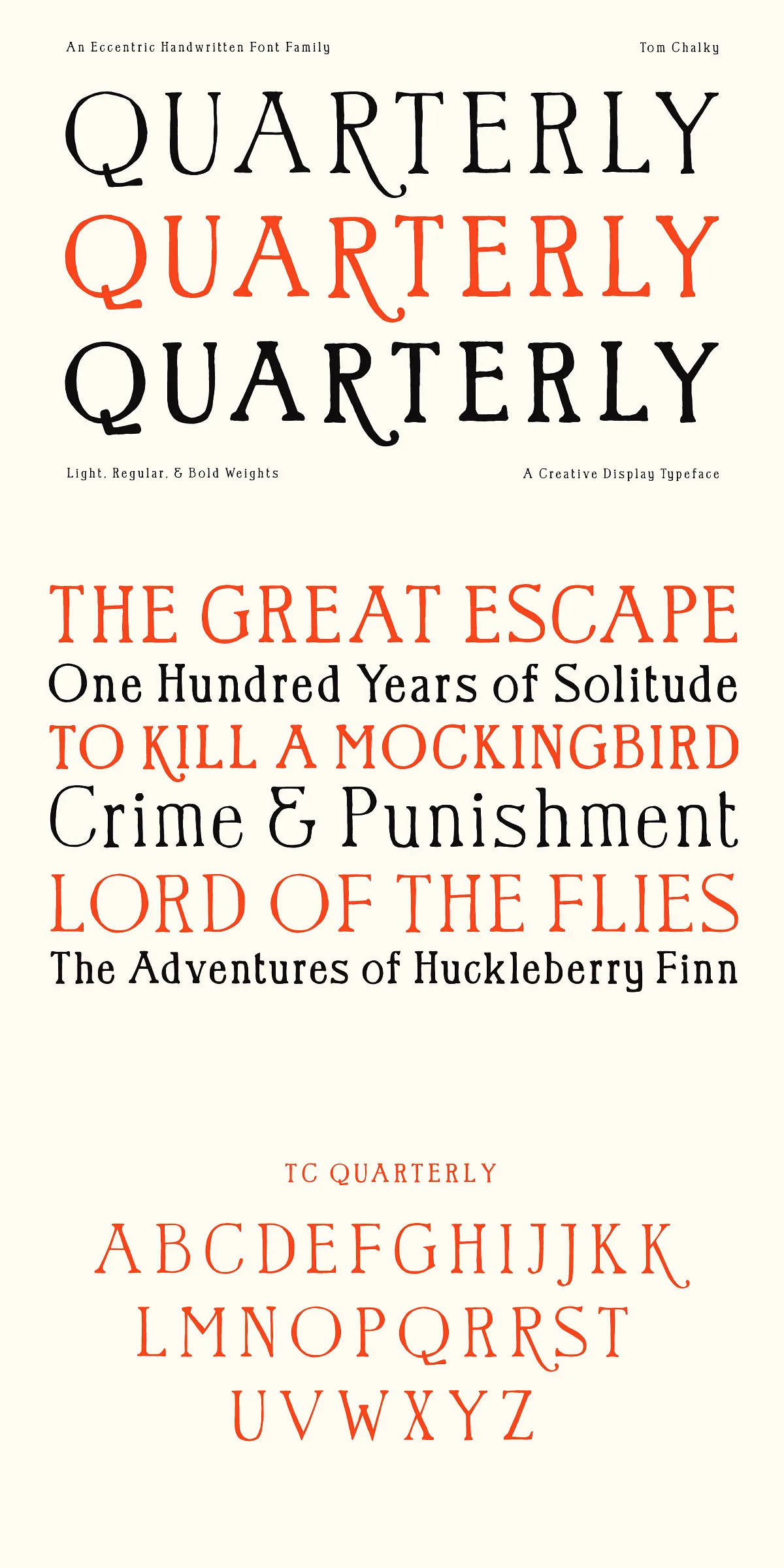
- Book Covers & Editorial Layouts: Perfect for literary works, coffee table books, journals, and magazines where narrative depth meets visual personality.
- Event Invitations & Stationery: Add warmth and charm to wedding invites, anniversary cards, baby showers, and more.
- Product Packaging & Labels: Use the bold, hand-drawn aesthetic to give products a DIY, artisanal feel.
- Social Media & Digital Campaigns: Bring energy and authenticity to Instagram posts, YouTube thumbnails, and email newsletters.
- Art & Typography Displays: Transform quotes and poetry into visual statements with dynamic line weights and expressive letterforms.
Professional-Grade File Format & Easy Integration
Quarterly is delivered in industry-standard .otf (OpenType) and .ttf (TrueType) formats, compatible with Windows, macOS, iOS, and Android systems. Installation is quick and plug-and-play across all major design platforms.
No matter if you’re a freelance designer, a marketing team, a publisher, or an independent artist, Quarterly integrates smoothly into your workflow — from concept to final output.
Make Your Design Feel Alive — With Quarterly
Typography should do more than convey words. It should tell a story. It should feel human.
Quarterly isn’t just a font. It’s a voice. It’s the feeling of a pen moving across paper, the confidence of a handwritten note that means something. It’s the perfect blend of spontaneity and structure — the kind of typeface that helps your message land with heart, authenticity, and impact.
So go ahead — use it on a book cover. Let it lead your brand. Let it add soul to your next campaign. Quarterly awaits your next bold creative leap.