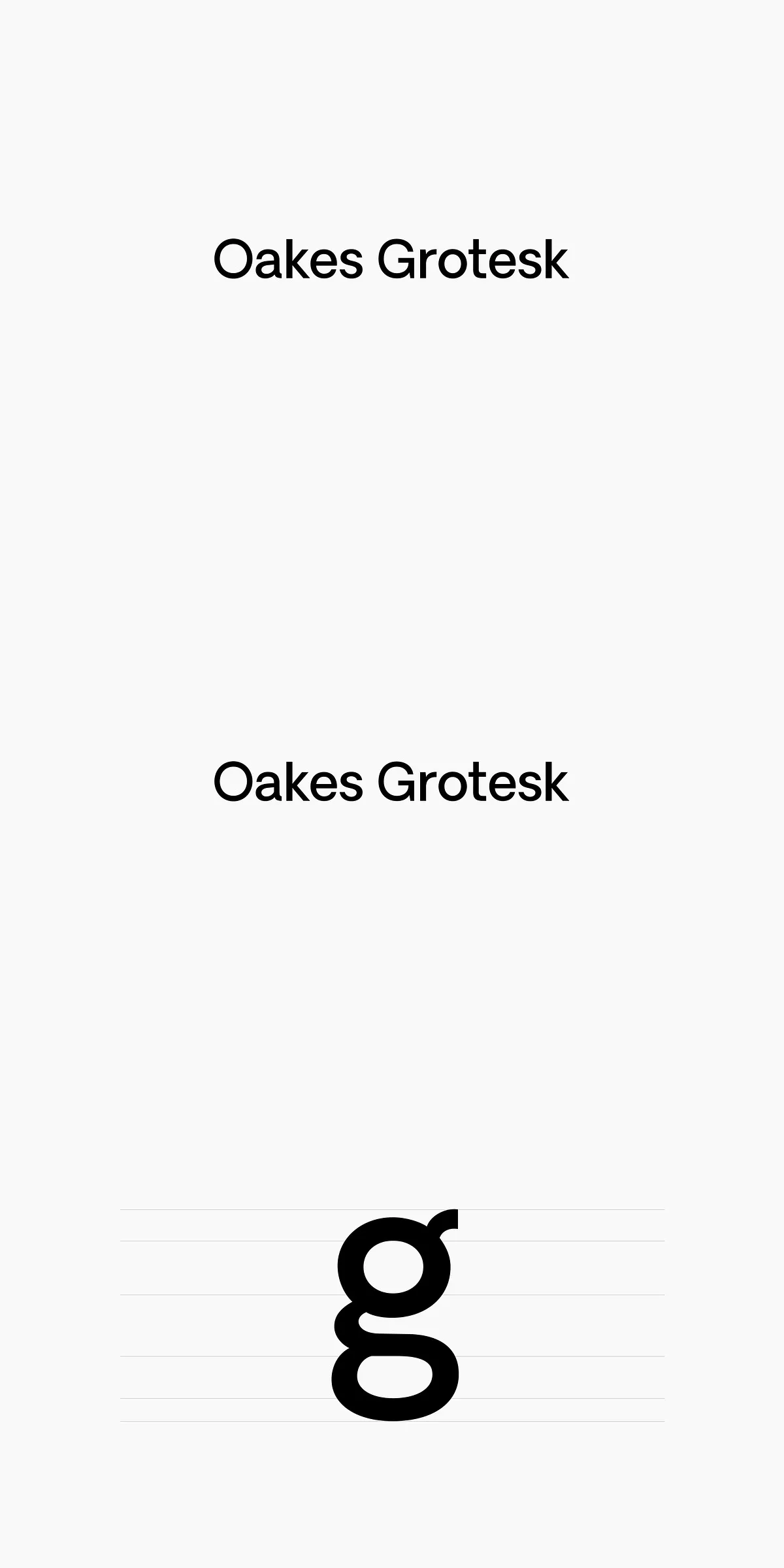

Oakes Grotesk reimagines the original Oakes typeface with a corporate focus, offering a fresh set of metrics that enhance legibility both in body text and headings. This refined typeface adapts classic grotesque design principles while introducing contemporary improvements that make it an ideal font for professional and branding purposes.
Precision in Design: Subtle Curves and Refined Characters
The design of Oakes Grotesk pays special attention to subtle curves and refined detailing that elevate its overall aesthetic. One of the most notable enhancements is the transformation of the letter ‘g’ into a double-story design, providing greater distinction and improved readability. Other characters have undergone meticulous refinement to maintain harmony and balance, ensuring smooth visual flow across text blocks.
Enhanced Legibility for Body Text and Headings
Oakes Grotesk’s optimized letterforms and spacing contribute to exceptional legibility, making this typeface versatile for both extended body text and impactful headings. The careful adjustment of metrics supports clarity in small sizes and prominence in larger displays, giving designers flexibility in various contexts—from corporate reports to website headers and marketing materials.
Comprehensive Language Support for Global Reach
This typeface supports an extensive range of languages, including Baltic, Basic Latin, Central European, Dutch, Euro, Romanian, Turkish, and Western European scripts. This broad language compatibility ensures that Oakes Grotesk can be reliably used in diverse international projects, maintaining consistent typographic quality across multiple languages and regions.
Applications for Professional and Corporate Branding
Oakes Grotesk’s corporate style and functional design make it highly suitable for a variety of professional applications. It excels in branding, where clear and trustworthy typography is crucial, as well as in editorial design, digital interfaces, presentations, and advertising. Its modern grotesque appearance helps convey professionalism while retaining a friendly and approachable character.
File Inclusions and Technical Specifications
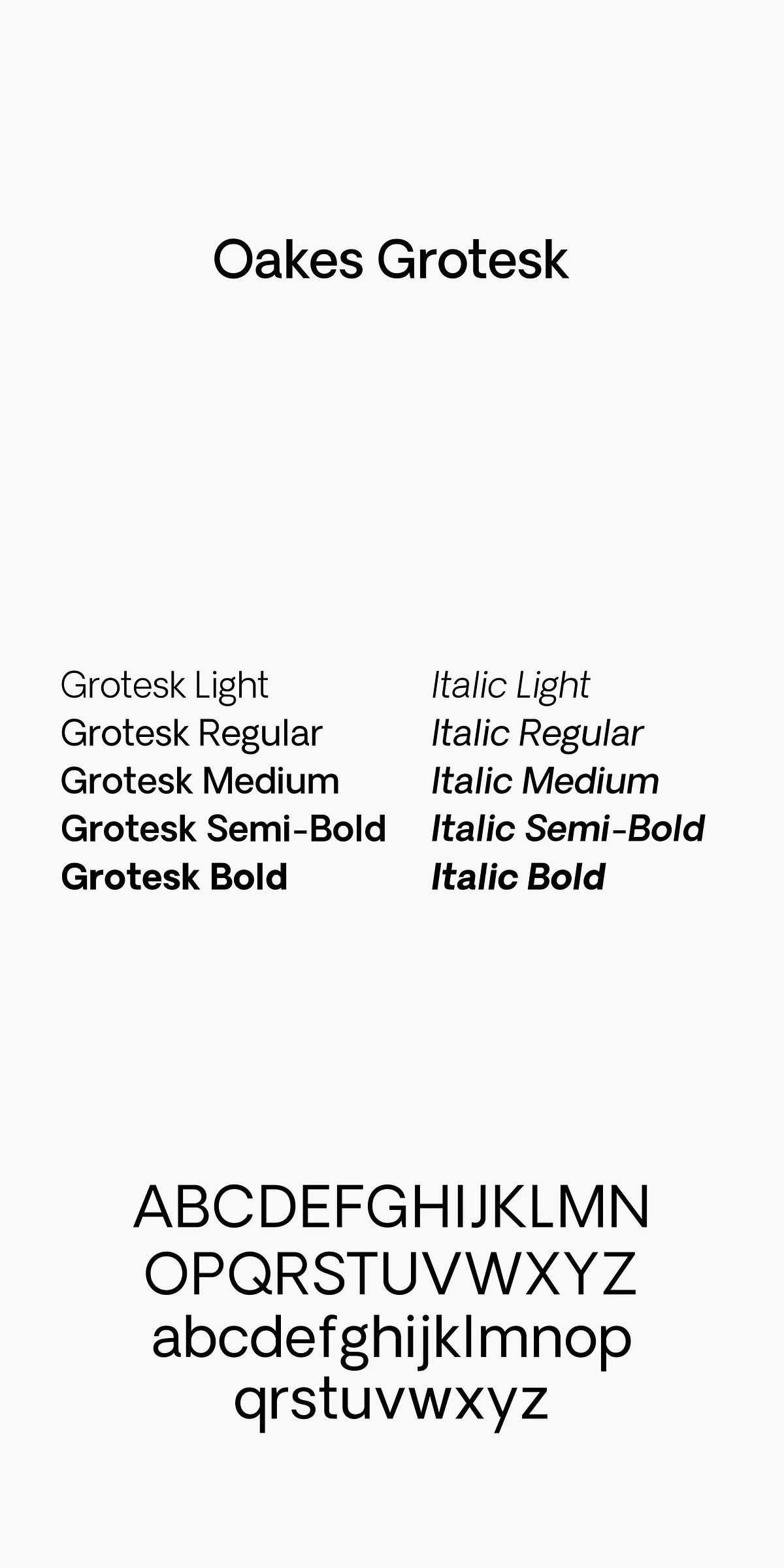
The Oakes Grotesk font family is crafted with precision to support a broad set of characters and typographic features. It is available in multiple weights and styles that complement each other to offer comprehensive typographic solutions. The font files are compatible with major design software and digital publishing platforms, assuring seamless workflow integration.
- Refined double-story ‘g’ and other character updates
- Optimized metrics for improved legibility
- Support for Baltic, Basic Latin, Central European, and more languages
- Versatile use for body text, headings, branding, and digital content
Elevate Your Typography with Oakes Grotesk
Choose Oakes Grotesk for your next project to experience a corporate sans serif that blends refined detail with practical functionality. This typeface empowers designers and brands to communicate clearly and confidently, optimizing readability without compromising style. Its balanced characteristics make it an essential asset for modern, professional typography across diverse media.
Whether you are designing corporate communications, websites, or printed materials, Oakes Grotesk offers the sophistication and clarity you need to create compelling visual narratives.