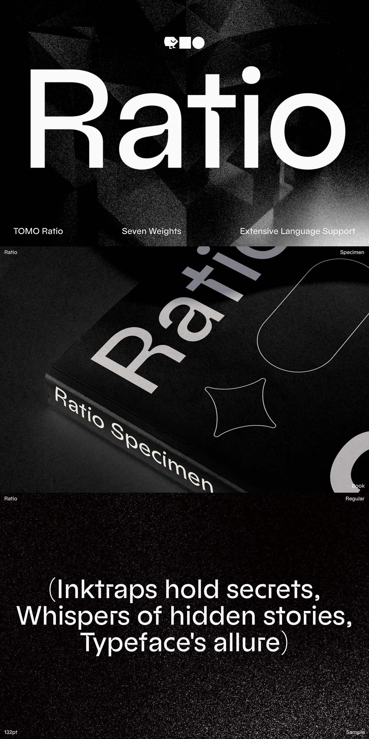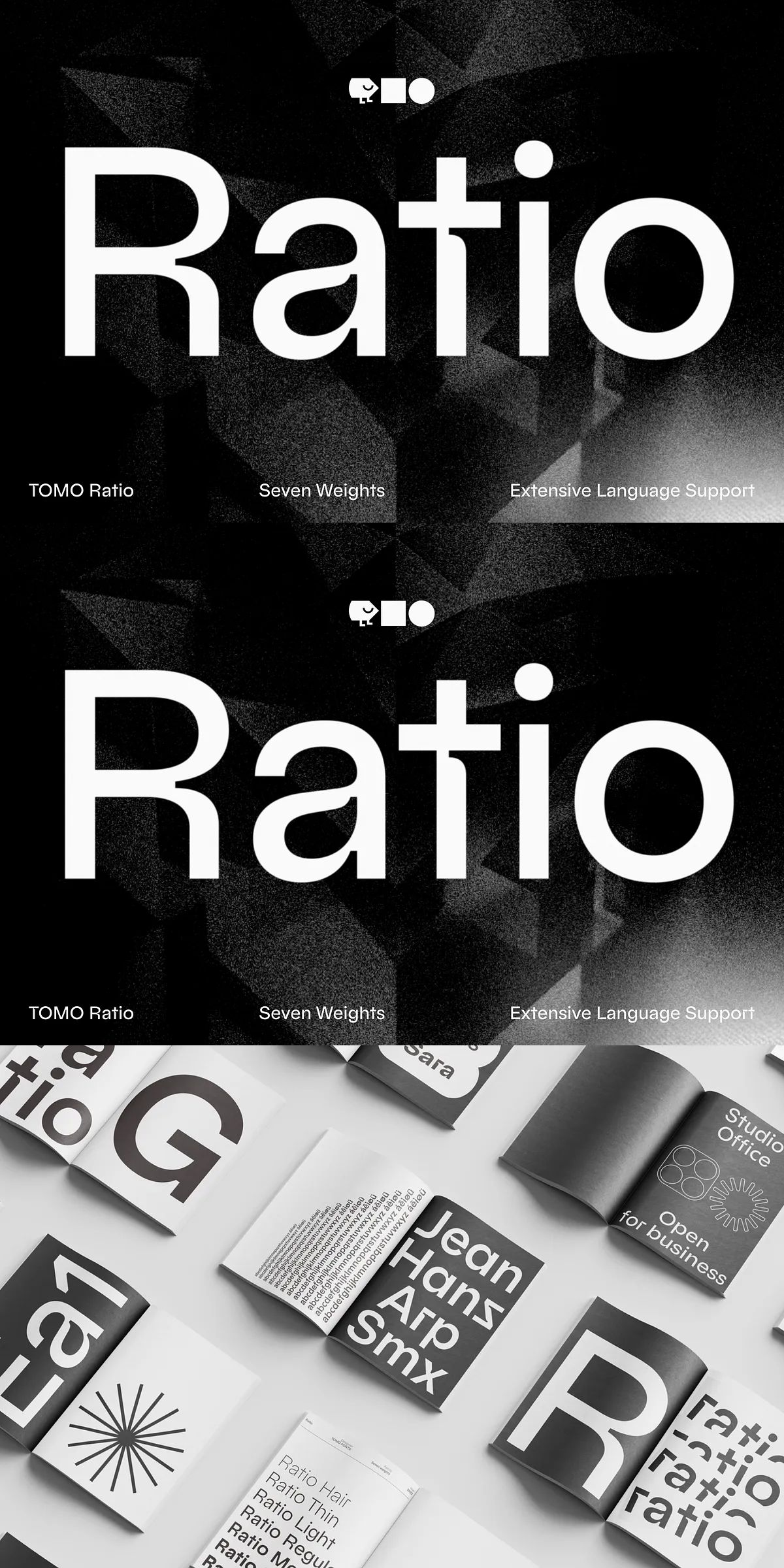
Step into the future of type design with TOMO Ratio, a meticulously crafted font that redefines the intersection of classic and modern aesthetics. Rooted in the enduring principles of mid-century modernism and infused with the geometric clarity of the Bauhaus movement, TOMO Ratio brings a bold reinterpretation of form, space, and rhythm. Inspired by the minimalist grace of Futura’s lowercase anatomy and the expressive depth of refined inktraps, this typeface delivers a harmonious fusion of heritage and innovation—perfect for designers who value both structure and soul in their typography.
Seven Weights, Infinite Possibilities: Design with Dynamic Range
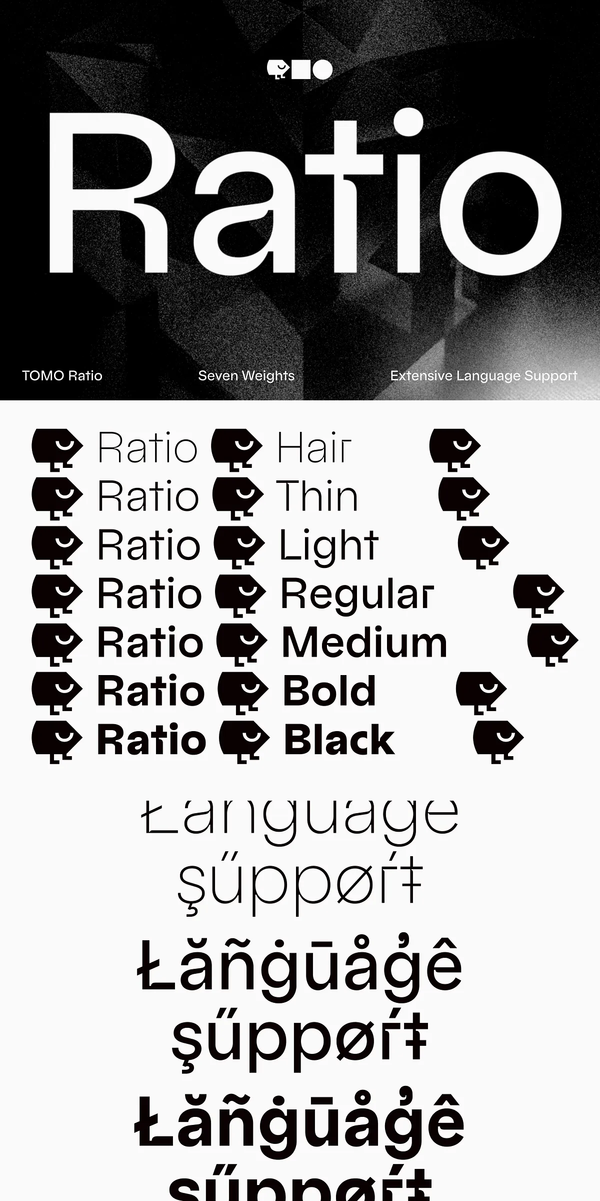
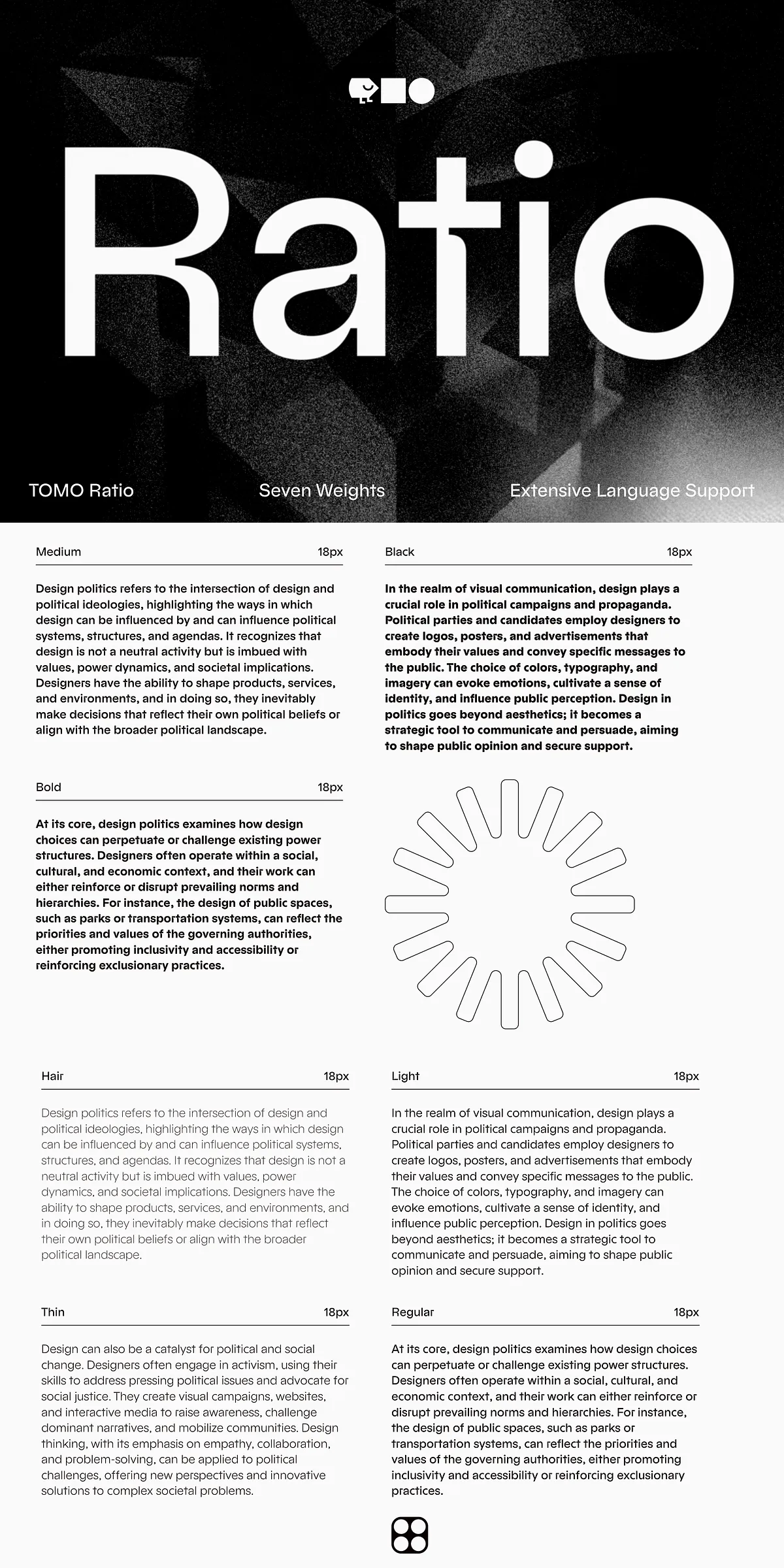
Constructed with a comprehensive 7-weight family, TOMO Ratio empowers designers to build rich typographic hierarchies with effortless consistency:
- Light and Thin – Ideal for elegant headlines, editorial layouts, and subtle emphasis in branding.
- Regular and Medium – The workhorses of clean, professional communication across corporate documents, web interfaces, and print media.
- Semi-Bold and Bold – Command attention in headlines, signage, and digital banners with strong visual impact.
- Extra-Bold – Perfect for striking logos, cover designs, and large-scale display typography that demands presence.
Each weight maintains the same balanced proportions, seamless stroke transitions, and refined inktrap optimization, ensuring cohesive visual storytelling across all applications.
Inktrap Mastery: Elevating Form Through Intentional Negative Space
TOMO Ratio doesn’t just incorporate inktraps—it celebrates them. Every curved and diagonal stroke is strategically designed to capture ink in key areas, enhancing legibility and visual rhythm while reinforcing the typeface’s architectural precision:
- Deliberate inktrap shaping at junctions of serifs and diagonal strokes ensures optimal ink absorption without blurring—critical for both print and digital rendering.
- Spurless character design eliminates distracting protrusions, allowing smooth transitions and refined line integrity across every glyph.
- Dynamic contrast control between thick and thin strokes prevents visual fatigue, even in long-form text blocks or dense layouts.
- Improved legibility in small sizes, thanks to enhanced open counters and consistent spacing—ensuring clarity at any scale.
This meticulous attention to detail transforms TOMO Ratio from a mere typeface into a tactile experience—where each letter seems to breathe, pause, and resonate with intention.
OpenType Stylistic Sets: Unlock Hidden Expressiveness
Beyond its foundational design, TOMO Ratio unlocks creative potential through powerful OpenType stylistic sets. These advanced features allow you to dynamically adjust the typeface’s personality without altering the core character shapes:
- Stylistic Set 1 (SS01): Introduce alternative lowercase forms with refined inktrap variations for a more expressive, handcrafted feel.
- Stylistic Set 2 (SS02): Swap in high-contrast terminals and sharper serifs for a more dramatic, modernist presentation.
- Stylistic Set 3 (SS03): Activate subtle ligature options for harmonious word flows in headlines and quotations.
- Stylistic Set 4 (SS04): Enable elegant swash alternatives for select uppercase and lowercase letters—ideal for premium branding and editorial styling.
These features integrate seamlessly into Adobe Creative Suite, Microsoft Word, Figma, and other design platforms, offering designers immediate access to stylistic diversity without the need for multiple font files or complex workarounds.
Designed for Tomorrow’s Brands — Built on Yesterday’s Principles
TOMO Ratio isn’t just a font. It’s a visual philosophy:
- 7 weights, 100+ glyphs, comprehensive multilingual support—including Latin Extended, Greek, and Cyrillic subsets for global projects.
- Variable font support available (in select editions), enabling continuous scaling across weights and optical sizes.
- Extensive OpenType features including old-style numerals, fractions, ligatures, and stylistic alternates.
- Compatibility with all major design environments—Photoshop, Illustrator, InDesign, Sketch, Figma, Webflow, and CMS platforms including WordPress.
- PDF User Guide included with installation instructions, typographic best practices, and usage recommendations for branding, web typography, and editorial design.
Whether you’re crafting a luxury fashion brand identity, launching a cutting-edge tech startup, or building a thought-leadership publication, TOMO Ratio delivers a voice that is both timeless and urgent—resonant with history, yet unmistakably forward-looking.
Pioneer Your Narrative: Let TOMO Ratio Speak for Your Vision
Stop choosing fonts that blend in. Start selecting one that commands presence. TOMO Ratio is not a background element—it’s a statement of design intelligence. With its roots in architectural purity, its soul in expressive detail, and its future in open, adaptive technology, this typeface is engineered to elevate every message you create.
Embrace the fusion of form and function. Harness the spirit of Bauhaus. Own the space—digitally and physically—with TOMO Ratio.