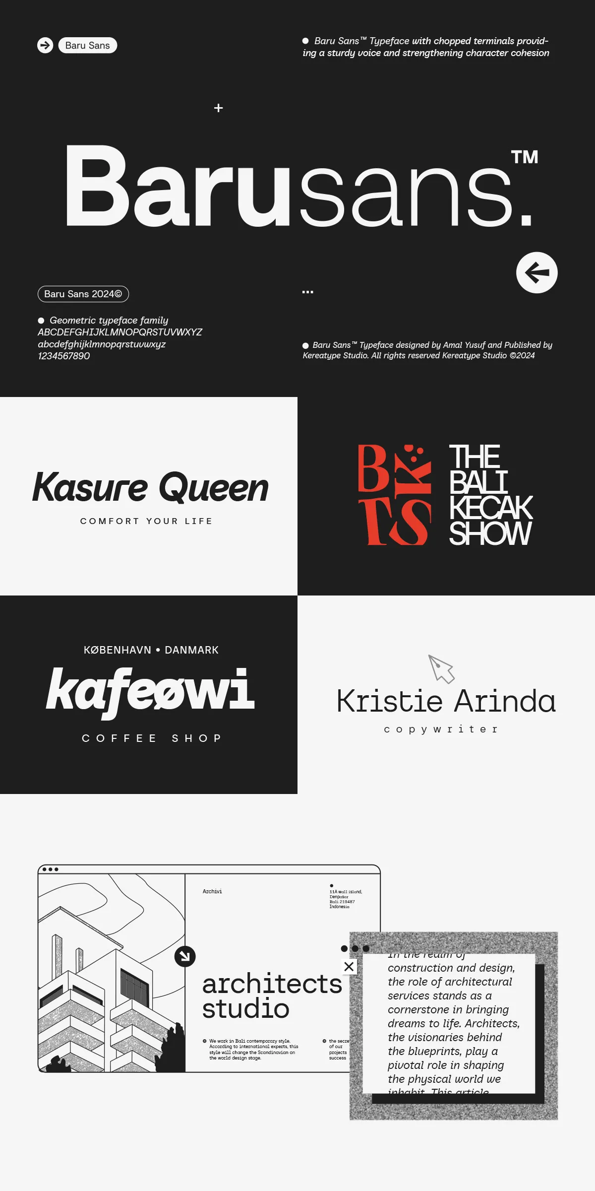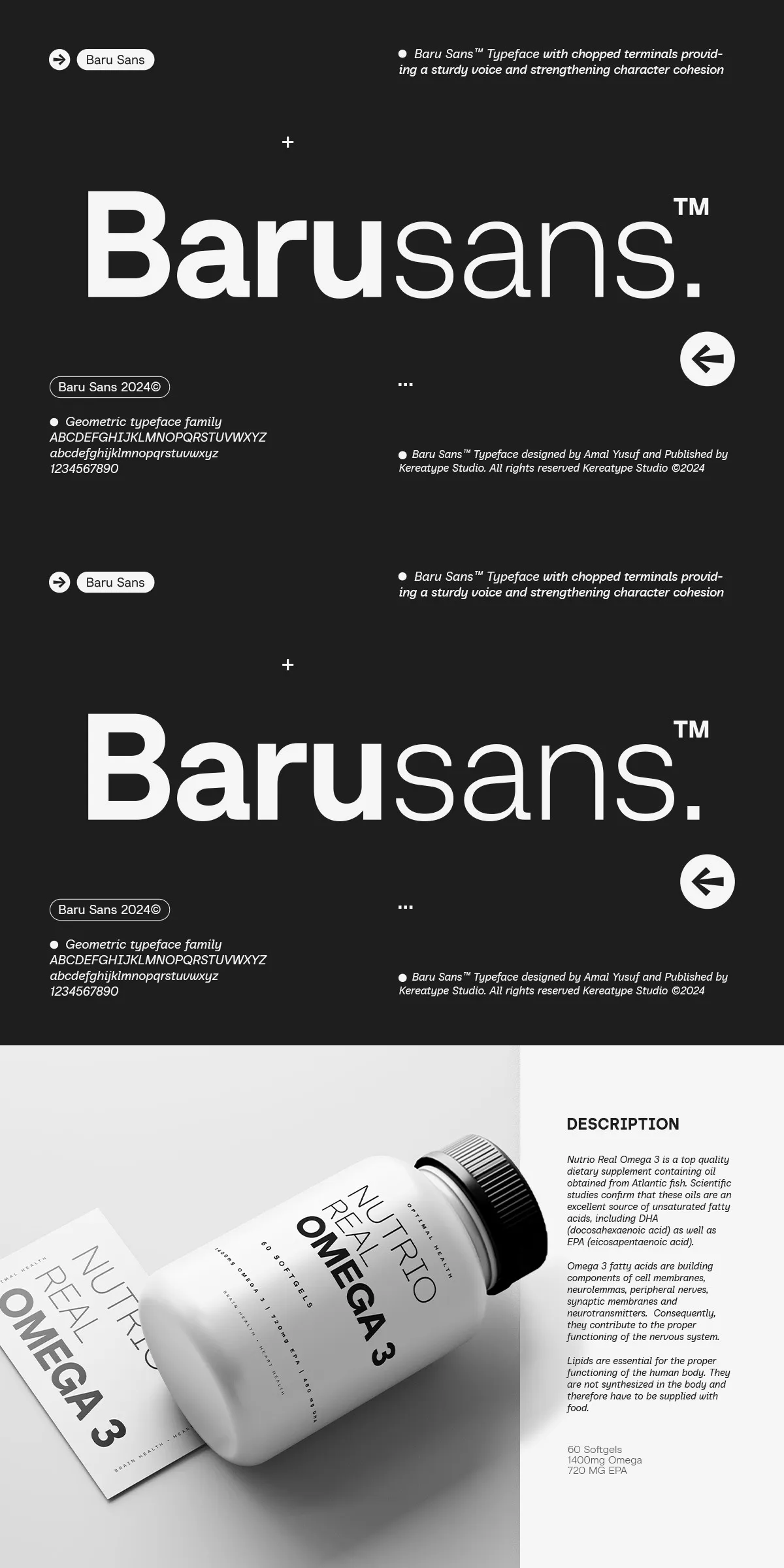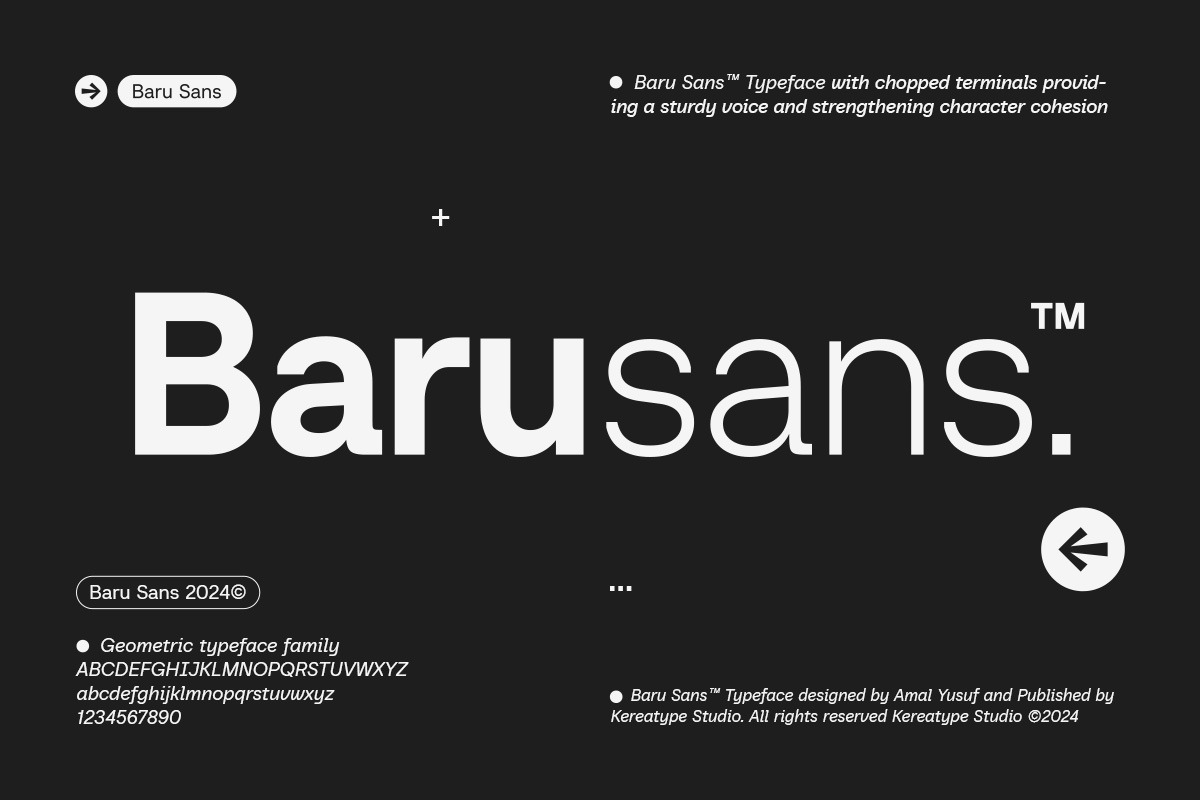
Meet Baru Sans—a geometric typeface that doesn’t just follow design trends. It defines them. Born from the fusion of mathematical precision and expressive humanism, Baru Sans delivers a bold visual language that’s both structured and alive. With chopped terminals, sharp 90º strokes, and a striking balance between machine-like symmetry and organic warmth, this font is engineered for impact.
The Geometry of Strength: Chopped Terminals, Bold Axes
Baru Sans takes geometry to its limits—literally. Its signature chopped terminals are not just a stylistic choice; they’re a declaration of intent. These clean, angular endings eliminate soft curves, replacing them with decisive, 90º breaks that reinforce structure and presence. Whether in headlines, labels, or motion graphics, these sharp terminations create a sense of tension, focus, and modern energy.
Every stroke in Baru Sans is deliberate. The consistent 90º angle across terminals, serifs, and junctions forms a visual rhythm that guides the eye with clarity and control. This architectural precision is perfect for high-impact designs where readability and style go hand-in-hand—branding, packaging, editorial layouts, and digital interfaces.
Humanism Meets Automation: The Italic That Breathes
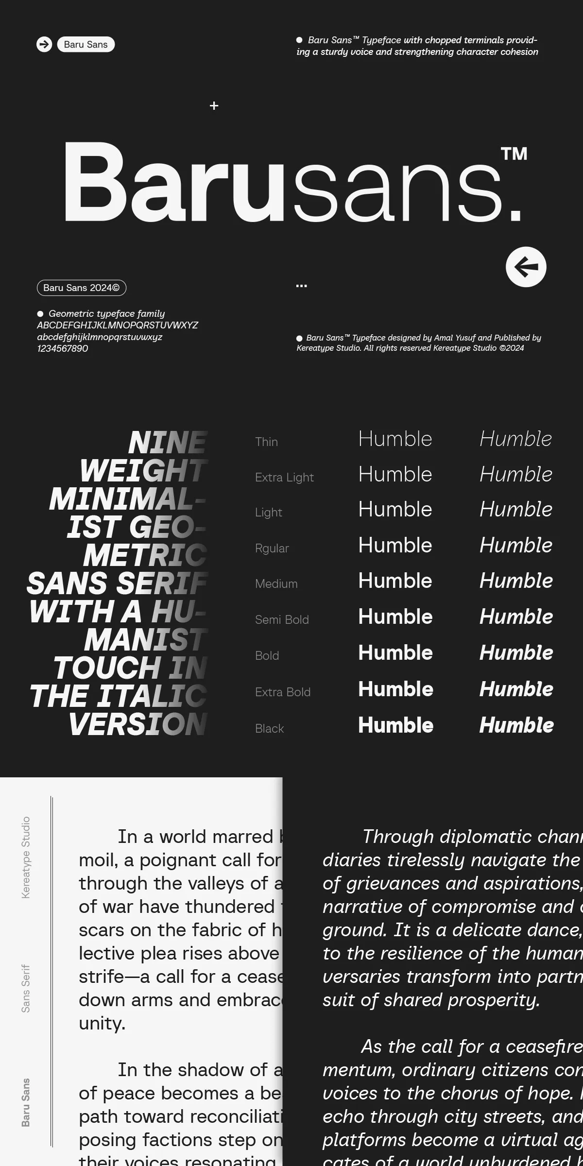
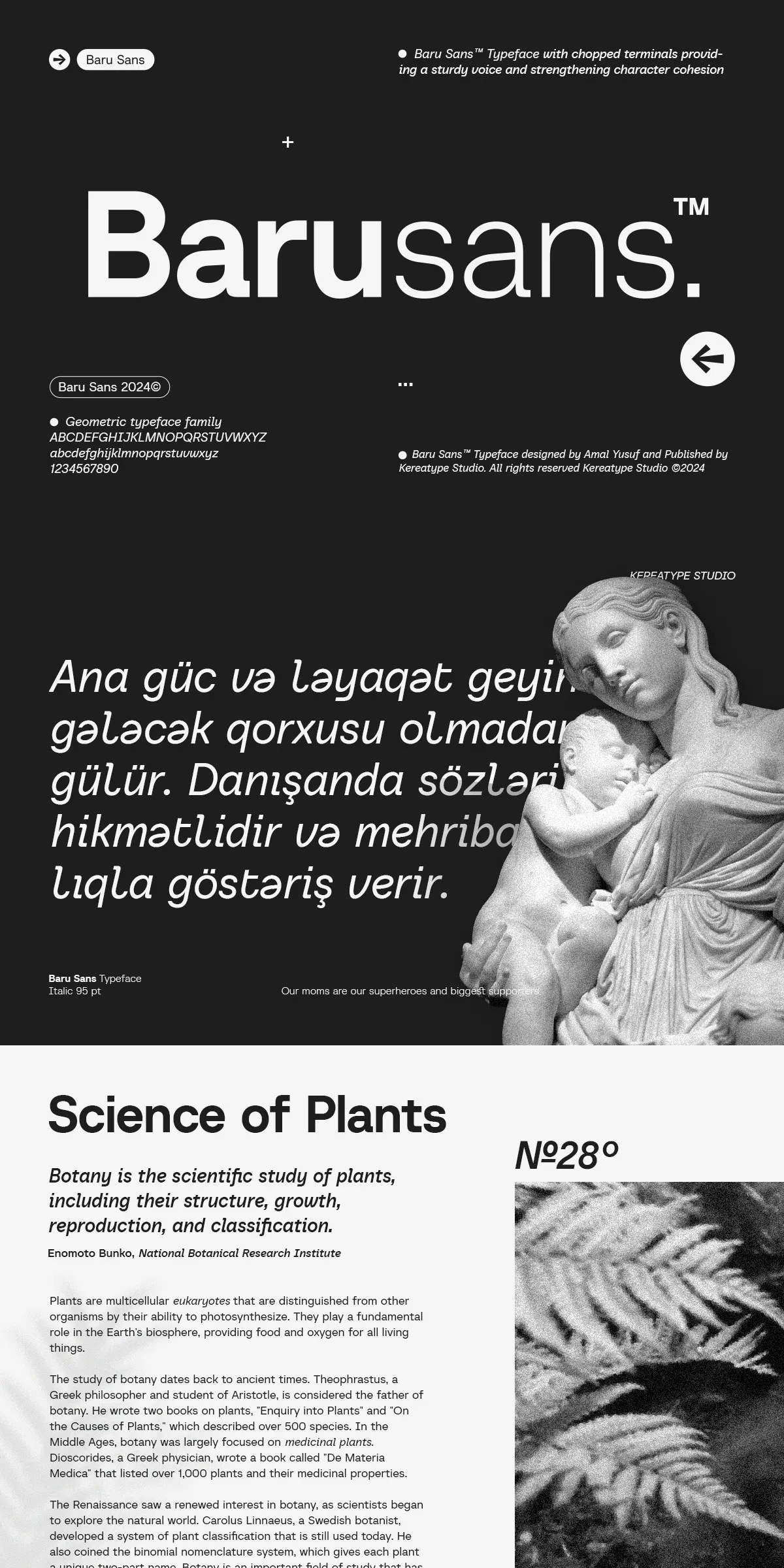
While the regular weights embody geometric rigor, the italic versions of Baru Sans surprise with their humanist soul. Inspired by the natural flow of handwriting, these italics introduce gentle slants, subtle stroke variation, and organic weight shifts—proof that even the most structured forms can feel alive.
With both upright italics and true italics included, Baru Sans gives you precise control over tone and emphasis.
- Upright italics maintain the geometric alignment while adding a subtle slant—ideal for consistency in long-form text.
- True italics swing into authentic hand-drawn curves and dynamic motion—perfect for editorial pull quotes, creative titles, and expressive narratives.
18 Fonts, Infinite Possibilities: 9 Weights for Every Need
Baru Sans isn’t a single font. It’s a full typographic ecosystem. With **9 distinct weights**—from delicate Thin to commanding Super—you gain the flexibility to express the full spectrum of design intent.
- Thin (100): Elegance in minimalism—ideal for subtle branding, light web headings, or artistic overlays.
- Light (300): Perfect for editorial subheads or clean interface typography.
- Regular (400): The workhorse—balanced, readable, and versatile for body text and headlines.
- Medium (500): Adds weight and presence—great for section titles and social media designs.
- Semibold (600): Command attention—use for callouts, bold labels, and impactful messaging.
- Bold (700): Strong and assertive—ideal for headlines, posters, and digital ads.
- Extra Bold (800): High-impact visual weight—perfect for motion graphics and large-format print.
- Black (900): Maximum intensity—use for dramatic headlines or design accents.
- Super (950): The pinnacle of visual power—designed to dominate layouts with raw presence.
With true italics and upright italics for each weight, you have full creative control—whether you’re designing a magazine spread or a motion-graphics sequence.
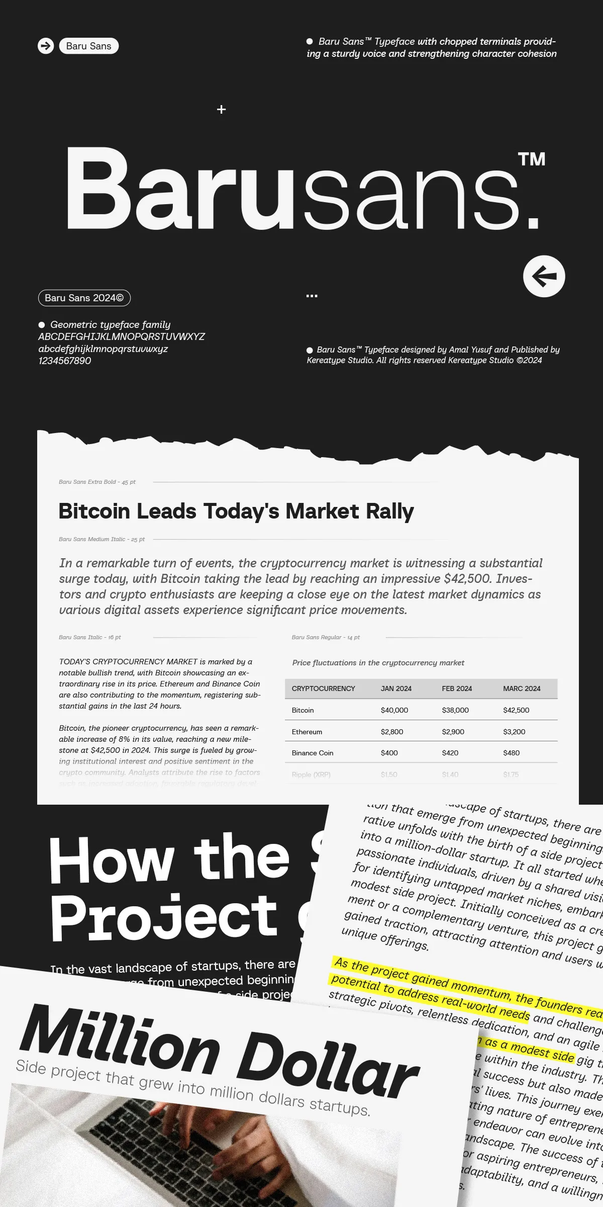
Designed for Modern Use: Print, Web, and Motion
Baru Sans is built for the real world—from digital screens to high-resolution print. Its scalable vector design ensures crisp clarity at any size.
Key features include:
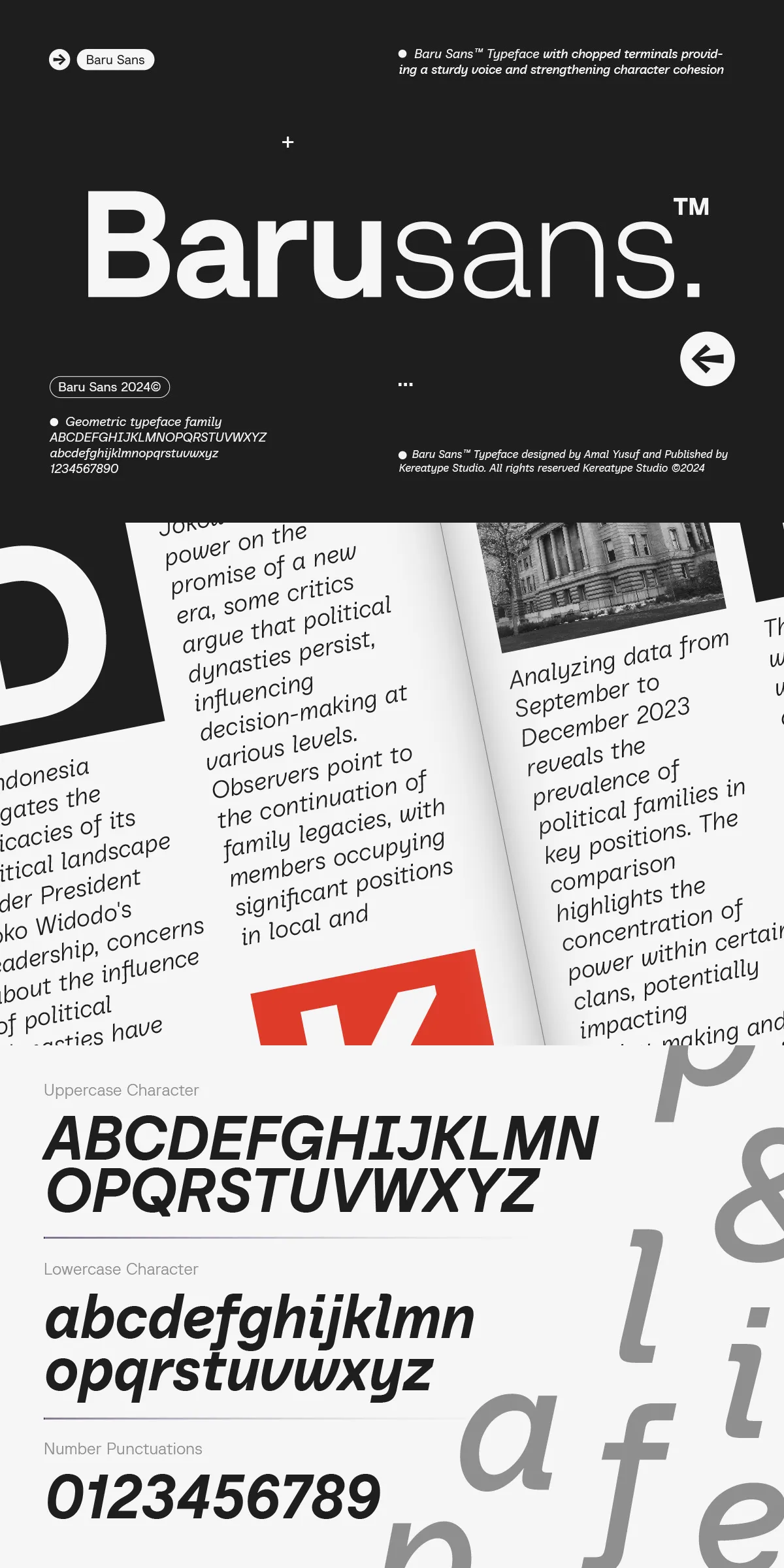
- Comprehensive glyph coverage—supports Latin, Cyrillic, and Greek scripts for global use.
- OpenType features—ligatures, stylistic sets, alternates, and fractions for professional typography.
- Variable font support—smooth weight transitions for dynamic design systems.
- Excellent legibility—even at small sizes, thanks to balanced x-height and spacing.
Why “Baru”? Because Design Is Always New
The name Baru means “new” or “fresh” in many languages—especially in Southeast Asian cultures. This isn’t just a name; it’s a philosophy. Baru Sans isn’t about copying the past. It’s about redefining the future of type.
It challenges designers to go beyond predictable templates. It inspires innovation in branding, storytelling, and user experience. Whether you’re building a tech startup’s visual identity or crafting a cultural magazine, Baru Sans brings fresh energy to every project.
So, step into the future of typography. Choose Baru Sans. Not just to communicate. To create. To influence. To begin.